| Author | Thread |
|
|
09/26/2004 08:33:40 AM |
Told you it could beat a 6 :)
Done it by a long way, congrats :) |
|
 Photographer found comment helpful. Photographer found comment helpful. |
|
|
09/13/2004 06:56:29 AM |
| No ones, twos, or threes!!! That's a first! Thanks everyone for your great comments! |
|
Comments Made During the Challenge  |
|
|
09/12/2004 11:35:50 PM |
| very nice tones and leading line. nice work. |
|
| Photographer found comment helpful. |
|
|
09/12/2004 11:34:30 PM |
| Great tones, like the leading lines, the textures, and the shadows. This Tone is fabulous.!!! |
|
| Photographer found comment helpful. |
|
|
09/11/2004 11:20:53 PM |
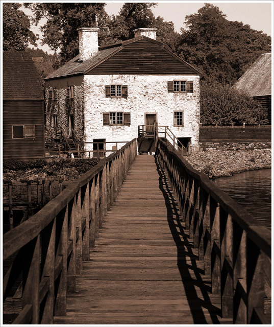
| I'd prefer to crop out perhaps 25% of the bridge |
|
| Photographer found comment helpful. |
|
|
09/11/2004 07:19:03 PM |
| This is a good crisp photo and a good story. Wonder if compositionally, it would also work well if you had positioned your camera at one or the other edge of the railing creating a diagonal to that exciting structure in the back. Not a critique, but a suggestion. Image is a good one. |
|
| Photographer found comment helpful. |
|
|
09/11/2004 02:06:25 AM |
| I like the sepia tone and it looks an interesting place to visit with lots of history |
|
| Photographer found comment helpful. |
|
|
09/09/2004 02:24:58 PM |
| Nice touch with the sepia. |
|
| Photographer found comment helpful. |
|
|
09/08/2004 08:33:35 PM |
| Nice leading lines - right to the center of interest. Your choice of sepia just right for this historical place. |
|
| Photographer found comment helpful. |
|
|
09/08/2004 06:48:02 PM |
| love this. i can almost hear the creaking of the bridge as i walk on it. very atmospheric. the history and attaction of the place is very well revealed. also, like the sepia tone - it emphasizes well the years passed... |
|
| Photographer found comment helpful. |
|
|
09/07/2004 11:37:30 PM |
| LOve the black and white with sepia added. Great shot. |
|
| Photographer found comment helpful. |
|
|
09/07/2004 10:31:30 PM |
| Beautiful! I love the leading lines. (9) |
|
| Photographer found comment helpful. |
|
|
09/07/2004 10:41:18 AM |
| Nice concept, but a little too centered |
|
| Photographer found comment helpful. |
|
|
09/07/2004 07:09:24 AM |
| Excellent perspective here and great choice of sepia. |
|
| Photographer found comment helpful. |
|
|
09/06/2004 09:41:47 PM |
| Nice image and good, if not quite appropriatefor the challenge, sepia treatment. I usually imagine a colour image for "... an image that represents an area as a visitor might see it". But that's just me. |
|
| Photographer found comment helpful. |
|
|
09/06/2004 02:53:51 PM |
| Creative use of dualtones -- really fits for travel |
|
| Photographer found comment helpful. |
|
|
09/06/2004 12:33:40 PM |
| I love the way that the dock draws your eye to the manor. Great shot! |
|
| Photographer found comment helpful. |
|
|
09/06/2004 04:06:55 AM |
|
| Photographer found comment helpful. |
|
|
09/06/2004 04:06:20 AM |
| Good choice going with duotone with this photo. It seems to add to the feel that the building is old and historic. The use of the bridge/walkway to lead the eyes to the building is also good. It's hard to tell if the building is actually that way or if contrast is an issue. It seems that the chimney is a bit overexposed but it's probably that way. 9 |
|
| Photographer found comment helpful. |
|
|
09/06/2004 02:33:04 AM |
| Looks like an interest story straight from a magazine. Good job. |
|
| Photographer found comment helpful. |
|
|
09/06/2004 01:56:53 AM |
| Gorgeous photo. Great toning and lighting, however the blown out whites may be a little too much. 8 |
|
| Photographer found comment helpful. |
Home -
Challenges -
Community -
League -
Photos -
Cameras -
Lenses -
Learn -
Help -
Terms of Use -
Privacy -
Top ^
DPChallenge, and website content and design, Copyright © 2001-2025 Challenging Technologies, LLC.
All digital photo copyrights belong to the photographers and may not be used without permission.
Current Server Time: 03/12/2025 08:21:06 PM EDT.