| Author | Thread |
Comments Made During the Challenge  |
|
|
09/12/2004 09:09:38 PM |
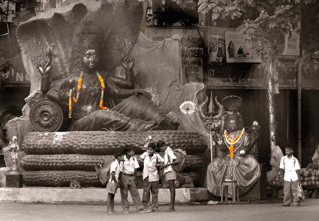
| The kids make thius picture. This appears to be an application of selective desaturation. For me, the bright colors of the garlands on the sculpture are distracting, as they shouldn't be the main focus. Otherwise, an interesting shot. |
|
|
|
09/12/2004 08:47:43 PM |
| the color you left is so minute in amount that it does not seem to be and effective use of select desat to me. Also some softness in the area above Shiva's head and under the palms of the tree. That aside, the rest of the picture is a wonderful slice of life with excellent contrasts of new and old throughout. |
|
|
|
09/11/2004 07:36:38 PM |
| Grat subject. Expect desaturation was a good idea because of the riot of colors that would compete for attention. But for some reason, it seems a bit soft. Still a fine entry for this Challenge. 6 |
|
 Photographer found comment helpful. Photographer found comment helpful. |
|
|
09/10/2004 09:29:34 PM |
returning for comments
An interesting comp to accent the size of these statues. |
|
| Photographer found comment helpful. |
|
|
09/09/2004 05:35:30 PM |
| I like this! great use of color and details... |
|
| Photographer found comment helpful. |
|
|
09/08/2004 06:17:52 PM |
|
| Photographer found comment helpful. |
|
|
09/07/2004 02:36:20 PM |
| Very good picture-. It is just it seems to be to much objects to catch attetion. The sight is wandering from one place to another. |
|
| Photographer found comment helpful. |
|
|
09/06/2004 11:53:14 PM |
| Very appealing shot but I'm not sure if it would not have been better to either make it all b/w or all color. But I still think it was a great capture fitting the subject. |
|
| Photographer found comment helpful. |
|
|
09/06/2004 07:00:15 PM |
| this is an interesting image, but do not understand why you desaturated it. |
|
| Photographer found comment helpful. |
|
|
09/06/2004 12:26:37 PM |
| I love your choice of selective desaturation. Great job! |
|
| Photographer found comment helpful. |
|
|
09/06/2004 08:35:24 AM |
| To me, the selective desaturation puts too much focus on the brightly colored flowers than on the children. If you were to still use the selec. desat...in this photo, I would do one of two things...desat everything but the children, or desaturate everything but the flowers and the child on the far right. This would add some extra interest to a potentially strong photo. |
|
| Photographer found comment helpful. |
|
|
09/06/2004 07:38:32 AM |
| I would like to have seen this all in color or all in B/W, but I do love the capture anyway. The selective desaturation doesn't work for me here, but it's not distracting enough to take away from a really great picture. :) Nice job. |
|
| Photographer found comment helpful. |
|
|
09/06/2004 03:42:03 AM |
| would like to see this in colour or full b&w but lovely! |
|
| Photographer found comment helpful. |
|
|
09/06/2004 01:42:52 AM |
| I like the photo but not the processing on this one. I don't like the effect of the selective desaturation as it calls attention to what I believe is not the main subject of the photo. I also don't like the bland sepia. I think this would have worked well as a black and white done so that the lightness in the kids shirts stood out more and brought the viewers attention to them. 7 |
|
| Photographer found comment helpful. |
Home -
Challenges -
Community -
League -
Photos -
Cameras -
Lenses -
Learn -
Help -
Terms of Use -
Privacy -
Top ^
DPChallenge, and website content and design, Copyright © 2001-2025 Challenging Technologies, LLC.
All digital photo copyrights belong to the photographers and may not be used without permission.
Current Server Time: 03/16/2025 07:42:21 PM EDT.