| Author | Thread |
|
|
01/16/2003 02:19:25 AM |
| Your comments were so encouraging, it made me feel so good after reading it even though it did so poorly in the challenge. I suppose because it was more a destination photo rather than a travel photo, plus I don't think the title was so good. Thanks once again for the wonderful critique! |
|
|
|
01/11/2003 04:29:48 PM |
Critique Club
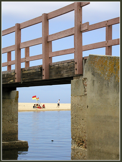
Does the subject grab your attention? Yes
Sharpness: Sharp
Is sharpness important? Yes
Exposure: I think the exposure is right.
Contrast: Contrast appears flat to me.
Color: The colors in my oppinion are very accurate.
It appears to be an overcast day and I think this shot was
taken at the right moment.
Composition:
Are the various elements of the photo well balanced within the frame?
I say Yes. Eyes are drawn correctly through the photo. Though the bridge can seem like a slight distraction, without it the picture is boring. You framed this shot well. If it fit the theme a little better in my oppinion you have a top 20 photo here. When I look at this shot I think more of the movie Jaws when Broadie told his son to take the boats and play in the lake or the Lagoon rather than the ocean.
Point of View: Personally I would have gotten down slightly. I think it is important to get some more water in the shot.Don't have to worry about getting the top of the rail in the shot. As long as you have the bridge you are fine.
Overall this is a great photo.
John (TurboTech)
Message edited by author 2003-01-11 20:07:34. |
|
 Photographer found comment helpful. Photographer found comment helpful. |
Comments Made During the Challenge  |
|
|
01/05/2003 11:36:11 PM |
| Unusual composition, good clear focus. Nicely done. |
|
|
|
01/05/2003 12:51:20 AM |
|
|
|
01/04/2003 08:36:19 PM |
| I find the bridge very distracting (lol just kidding; I'm sure some people told you that though). Excellent framing and very crisp colours. I love it. a well deserved 10. Jacko. |
|
|
|
01/04/2003 07:07:24 PM |
| Interesting composition. Clear shot. Like the choice of aperture. |
|
|
|
01/04/2003 09:29:37 AM |
| Nice colouring. Image lacking in composition though and the choice of title doesn't really add to it. |
|
|
|
01/02/2003 02:09:55 AM |
| Excellent composition (IMO maybe too much left at the top), but overall the colors, textures and lines of this really work well together. - z [8] |
|
|
|
01/01/2003 07:37:40 PM |
| I like how the beach is framed by the pier pillars. This is a beautiful shot. The texture in the concrete comes through as clearly as does the shore line. The timbers on the pier look to need replacing soon. Good job with great depth. Nice 10. PTL |
|
|
|
12/30/2002 09:26:49 PM |
| I commented on this although it seems to have lost it. Anyway - lovely detail in the bridge and columns. The sky is great and the water also. They look like Australian Surf Life Savers. Correct? |
|
|
|
12/30/2002 12:39:17 PM |
| I like the composition of this picture. Good job. |
|
Home -
Challenges -
Community -
League -
Photos -
Cameras -
Lenses -
Learn -
Help -
Terms of Use -
Privacy -
Top ^
DPChallenge, and website content and design, Copyright © 2001-2025 Challenging Technologies, LLC.
All digital photo copyrights belong to the photographers and may not be used without permission.
Current Server Time: 04/27/2025 01:51:03 PM EDT.