Greetings from the Critique Club :)
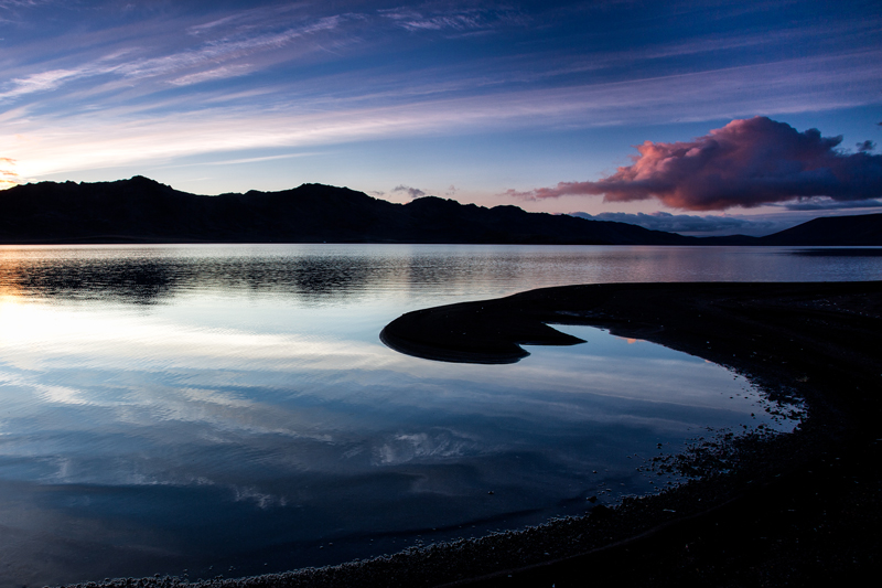
First impression: WOW
Technically great, nothing to nitpick about. I like your exposure, which gives a very interesting texture to the water. Beautiful natural colours.
It definitively meets the challenge and even better in an original way: a silhouette against a liquid background instead of air is refreshing.
So why did it not win? I think the answer is in the composition, which is maybe slightly to complex. There are so many things going on: lines in the sky, triangles in the mountains, curves on the beach,... It is a very interesting landscape indeed, but from the point of view of pure design, the elements do not fit perfectly. Maybe a closer framing around the beach tongue? Maybe you kept the left part of the picture because you wanted the highlights for contrast, but maybe another angle would have solved that problem.
Anyway, I was lucky to get such a nice photo to critique, I enjoyed studying it! If you have any questions or comments, feel free.
Cheers, Mike |