| Author | Thread |
|
|
01/06/2003 06:51:08 PM |
I voted you a 5 on this picture. I think that the composition is good. The color needs a little more saturation to really stand out and the contrast just isn't getting my interest.
I think that this was a great first effort by you though.
Good luck at DPC.
-- shohn/DPC Critique Club |
|
 Photographer found comment helpful. Photographer found comment helpful. |
|
|
01/06/2003 06:37:32 PM |
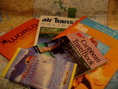
OK - so the carribean glow didn't work and you didn't get the fuzzy "dream" idea!!
And I'm not going anywhere - just hoping money will fall out of the sky so I can go somewhere!!!
oh, and PTL - the greyish area in the bottom right corner is water on the map - we'll have to discuss this with the Atlantic Ocean - tee hee hee!!!
Message edited by author 2003-01-06 19:50:19. |
|
Comments Made During the Challenge  |
|
|
01/05/2003 01:19:25 AM |
|
| Photographer found comment helpful. |
|
|
12/31/2002 10:31:58 PM |
| Well? Where did you end up going? Get rid of the dark yellow tint and this is fairly good. Don't like the grey lower right corner. Focus a little soft and appears to be a graininess. But not too bad. I'll give it a 5. PTL |
|
| Photographer found comment helpful. |
|
|
12/30/2002 04:52:23 AM |
| White balance seems a little off. |
|
| Photographer found comment helpful. |
Home -
Challenges -
Community -
League -
Photos -
Cameras -
Lenses -
Learn -
Help -
Terms of Use -
Privacy -
Top ^
DPChallenge, and website content and design, Copyright © 2001-2025 Challenging Technologies, LLC.
All digital photo copyrights belong to the photographers and may not be used without permission.
Current Server Time: 03/12/2025 01:18:55 PM EDT.