| Author | Thread |
Comments Made During the Challenge  |
|
|
09/12/2004 07:54:33 PM |
| Love the colors, lighting, and clarity. The extreme crop doesn't really enhance this shot though. |
|
|
|
09/12/2004 11:18:35 AM |
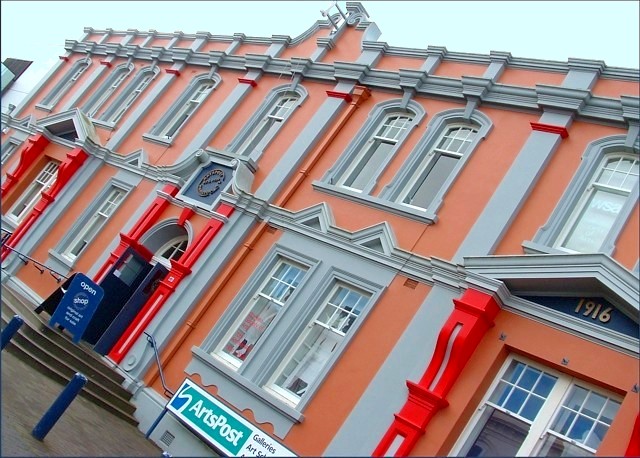
| the angle leaves me cold. The architecture is very nice, and the colors and exposure of the building are very good. Using the same angle, you might crop down and in left a bit a knock our the sky which is washed out. |
|
|
|
09/11/2004 07:42:18 PM |
| The angle is a major distraction from this fine fine picture otherwise. |
|
|
|
09/11/2004 07:03:10 PM |
| I like this approach and the color is lovely, but it is a bit too tilted in my opinion. I may need dramamine :) Good job though. |
|
|
|
09/11/2004 05:14:57 PM |
| Unusual building shot appropriately - the jaunty angle adding to the character of architecture nicely. Dull weather didn't help but you did well with what you had. |
|
|
|
09/09/2004 03:39:14 PM |
| Nice pic, but I feel like falling over.. ouch ;-) |
|
|
|
09/08/2004 03:33:04 AM |
| I've never seen an 'artistic' approach like this is a travel guide. Sorry, this doesn't work for me. The bland sky does not help the shot either. |
|
|
|
09/07/2004 08:13:15 PM |
| Interesting angle, great colour, nice and sharp |
|
|
|
09/07/2004 07:36:37 PM |
| Neither one thing nor the other, for me. The crazy angle might have been effective had you kept solely the colours and fframe-work in shot. The contextual elements of sky and pavement absolutely root it, and lose that impact. now it sems like a competent documentary shot given a wild tilt because it was felt to lack interest otherwise. Can you really iagine this being preinted in a guide book? I'm afraid I can't, personally. Abunch of good technical stuff, but let down by that odd compositional decision. |
|
|
|
09/07/2004 07:49:30 AM |
| Earthquake, run for your lives!!!!!!!!!!!!!!!!!! |
|
|
|
09/06/2004 01:38:31 PM |
| This is a very interesting view of the building, and I believe it adds a lot to the photo. Very nice! :) |
|
|
|
09/06/2004 05:16:20 AM |
| Interesting angle, but just a little too slanted to portray a building. The ArtsPost sign is also cut off and the sky washed out. |
|
|
|
09/06/2004 12:04:57 AM |
| Interesting vantage point. I like the color, but there is a lot of moire in this photo which is somewhat distracting |
|
Home -
Challenges -
Community -
League -
Photos -
Cameras -
Lenses -
Learn -
Help -
Terms of Use -
Privacy -
Top ^
DPChallenge, and website content and design, Copyright © 2001-2025 Challenging Technologies, LLC.
All digital photo copyrights belong to the photographers and may not be used without permission.
Current Server Time: 03/16/2025 10:08:46 AM EDT.