| Author | Thread |
|
|
09/02/2012 12:16:09 AM |
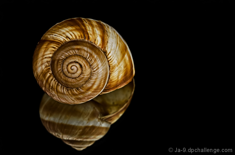
| A belated congrats on the top ten placement! Love all the great and wonderful details seen in this spiral shell. Lighting on the subject is superb! |
|
 Photographer found comment helpful. Photographer found comment helpful. |
|
|
08/29/2012 05:37:44 PM |
HI Janine - welcome back to the Critique Zone!
This is definitely a DPC crowd pleaser and a perfect fit for the challenge. I don't think my old laptop screen does it justice to be honest. I need to be on a shiny iPad or something!
Technically, there isn't a thing I would change about this. The sharpness is great, the DOF as good as it can be and the lighting is definitely what sets this apart from the average. Artistically there isn't much to call either. I agree with the comment about balancing this vertically in the frame - it is such a geometric shot that the bigger gap at the top really stands out. Picky, I know... The negative space, on the other hand, is critically important so I don't think that a tighter crop would be a good idea. I'd be interested to see it positioned on the right third rather than the left third but reserve the right to decide that you were right after all!
This is definitely you on form - congratulations!
Happy hunting,
Frank. |
|
| Photographer found comment helpful. |
|
|
08/29/2012 11:00:56 AM |
|
| Photographer found comment helpful. |
|
|
08/29/2012 08:08:54 AM |
| top 10, congrats, loved this from the first time I saw it |
|
| Photographer found comment helpful. |
|
|
08/29/2012 04:12:24 AM |
| Great to see you in the tt!!! |
|
| Photographer found comment helpful. |
|
|
08/29/2012 12:04:42 AM |
|
| Photographer found comment helpful. |
Comments Made During the Challenge  |
|
|
08/28/2012 08:33:11 PM |
| Good example but I would have preferred a crop that drew attention more the the static object that it is. 6 |
|
| Photographer found comment helpful. |
|
|
08/25/2012 12:57:07 PM |
I like the light and the colors. The image looks a bit flat and the main object somewhat disassociated from its reflection. Maybe this is due to that the sea shell looks quite sharp while the reflection does not. Wonder how the original image looks like.
I think I would have prefer a more central composition in the vertical direction. |
|
| Photographer found comment helpful. |
|
|
08/24/2012 02:26:37 PM |
| 7 from me. I love the black background. Not sure it wouldn't be even better without the reflection... so it was more stark. |
|
| Photographer found comment helpful. |
|
|
08/23/2012 04:58:47 PM |
| Uh oh, what a stunning picture. Very nice |
|
| Photographer found comment helpful. |
|
|
08/22/2012 11:50:55 AM |
| Amazing shot. So very nice! |
|
| Photographer found comment helpful. |
Home -
Challenges -
Community -
League -
Photos -
Cameras -
Lenses -
Learn -
Help -
Terms of Use -
Privacy -
Top ^
DPChallenge, and website content and design, Copyright © 2001-2025 Challenging Technologies, LLC.
All digital photo copyrights belong to the photographers and may not be used without permission.
Current Server Time: 12/14/2025 11:11:44 AM EST.