| Author | Thread |
|
|
09/13/2004 04:56:12 PM |
| too bad people always want big bold colors. underrated, even at 25th. |
|
 Photographer found comment helpful. Photographer found comment helpful. |
|
|
09/13/2004 12:09:18 AM |
| One of my top picks!!!!!! Congrats. |
|
| Photographer found comment helpful. |
Comments Made During the Challenge  |
|
|
09/12/2004 06:42:12 PM |
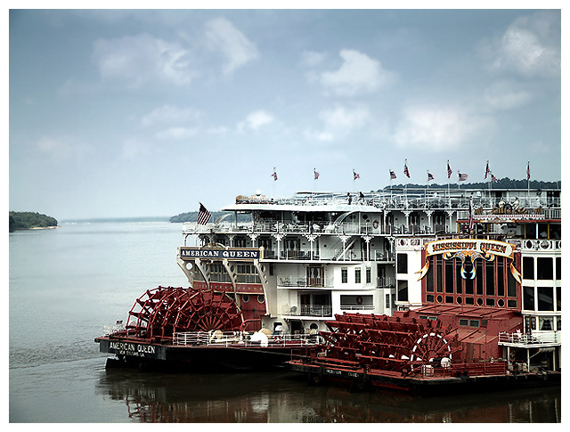
Love the composition and clarity of this shot.. it gives a real taste of the "deep south" and certainly what I would expect to see in any guide book for the area.
Very nicely done.
Bumping from 7 to 8 |
|
| Photographer found comment helpful. |
|
|
09/12/2004 02:18:09 AM |
I like this a lot! If there were a way to make the reds 'redder' then you would have a winner!
8 from me. |
|
| Photographer found comment helpful. |
|
|
09/10/2004 02:29:01 AM |
| Having grown up in New Orleans, I have a natural affinity for shots like this. ;-) For some reason, though it seems to be a bright day, the colors came out a little bit bland. You might want to increase contrast a bit in curves or just play with the saturation to see if the blues and reds can come out looking a bit more like they really did that day. Still, this is a nicely composed shot and I think the white matte adds a nice touch. |
|
| Photographer found comment helpful. |
|
|
09/08/2004 02:06:21 PM |
| Great subject for a travel guide. Seems a bit over exposed and the boats seem to merge together. |
|
| Photographer found comment helpful. |
|
|
09/07/2004 09:45:32 PM |
Very nice! I love the colors...How did it look with the rest of the reflections in the frame?
Good luck (9) |
|
| Photographer found comment helpful. |
|
|
09/07/2004 10:03:16 AM |
|
| Photographer found comment helpful. |
|
|
09/07/2004 07:50:14 AM |
| Fits the challenge quite well. Nice shot |
|
| Photographer found comment helpful. |
|
|
09/06/2004 09:55:17 AM |
I like the colors and the overall tone. I allso have a fetish for boats.
Good work. |
|
| Photographer found comment helpful. |
|
|
09/06/2004 08:40:37 AM |
| Don't get me wrong, I really enjoy viewing this photo, great job, but this comment will be focused on what I think are the negative aspects. I believe that you selectively desaturatedthe upper three decks of the far ship. Why? That added distraction to the image IMHO. Also, the composition leaves us with an incredibly detailed and interesting foreground to an emty background. Otherwise, I still really like this shot. Perhaps if you were to photograph this in the future, you would compose with less sky and more of the boats' reflections in the water. 7. |
|
| Photographer found comment helpful. |
|
|
09/06/2004 08:14:41 AM |
| Very nice nostalgic feel. |
|
| Photographer found comment helpful. |
|
|
09/06/2004 03:15:01 AM |
| Beautiful, could see this being in a brochure. |
|
| Photographer found comment helpful. |
|
|
09/06/2004 01:46:18 AM |
| i really like how you didn't push the colors, which let the shapes and details dominate. |
|
| Photographer found comment helpful. |
|
|
09/06/2004 01:31:35 AM |
| I love the sharpness in the boats in contrast to the textures in the water and the sky. Great photo! Good luck in the challenge! |
|
| Photographer found comment helpful. |
|
|
09/06/2004 01:24:32 AM |
| I really like this one. it looks like a postcard. I think the color could have been a bit more vivid with adjustment. |
|
| Photographer found comment helpful. |
Home -
Challenges -
Community -
League -
Photos -
Cameras -
Lenses -
Learn -
Help -
Terms of Use -
Privacy -
Top ^
DPChallenge, and website content and design, Copyright © 2001-2025 Challenging Technologies, LLC.
All digital photo copyrights belong to the photographers and may not be used without permission.
Current Server Time: 03/12/2025 07:57:46 AM EDT.