| Author | Thread |
Comments Made During the Challenge  |
|
|
10/09/2012 02:09:59 PM |
| Not sure this is a good example of Negative Space. The image could also use more processing (contrast). |
|
|
|
10/09/2012 12:04:43 PM |
|
|
|
10/04/2012 12:00:03 PM |
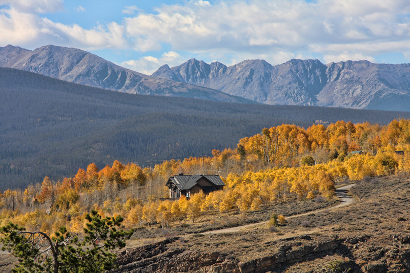
Very nice scene. Great layers of fall colors against the evergreens against the rock against the clouds and sky.
If I were to have taken this, however, I probably would have cropped it differently. Cliche rule, but the structure is just a bit too centered for me, and I find the tree to the bottom left distracting; as well as the rock cliff face in the bottom. It's all just a bit busy and it detracts from the POP of those great colors and the overwhelming scale of the scenery.
I would have likely gone for a square crop, eliminating the evergreen in the bottom left and the cliffs at the bottom. This would showcase the colors a bit more, enhance the power of the layers (as they would not be interrupted by the tree), and even draw more attention to the great windy road that is currently fairly lost in all else that is going on. And pertaining to the challenge, anchoring the structure in the bottom left and eliminating the distracting foreground would play up the sense of immense space and solitude (in my mind at least).
It's a beautiful scene, and taken well. Just a bit of a different presentation would have gotten higher marks out of me. |
|
|
|
10/03/2012 02:22:48 PM |
| This is a beautiful photo, but I don't see the use of negative space here. |
|
Home -
Challenges -
Community -
League -
Photos -
Cameras -
Lenses -
Learn -
Help -
Terms of Use -
Privacy -
Top ^
DPChallenge, and website content and design, Copyright © 2001-2025 Challenging Technologies, LLC.
All digital photo copyrights belong to the photographers and may not be used without permission.
Current Server Time: 03/12/2025 02:13:55 AM EDT.