| Author | Thread |
Comments Made During the Challenge  |
|
|
10/11/2012 10:56:47 AM |
| LOL!!!!! The title makes it for me! |
|
 Photographer found comment helpful. Photographer found comment helpful. |
|
|
10/10/2012 05:05:50 AM |
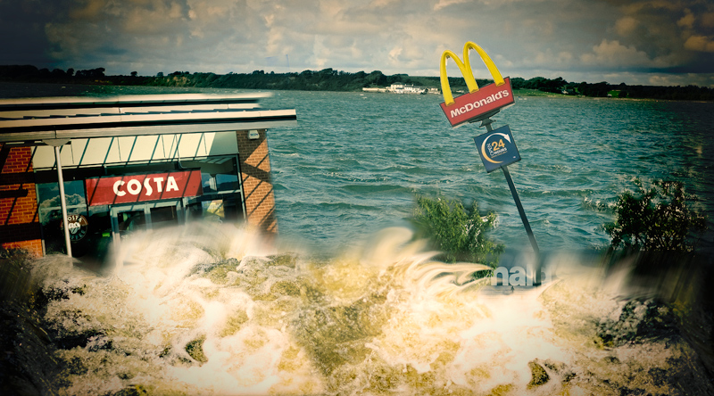
| The text at the bottom of the golden arches sign is a blemish on the editing, certainly. The waves crashing into your scene are blurred in a heavy handed fashion, but it's much more forgivable except where the Micky D's text is, where it is very glaring. |
|
| Photographer found comment helpful. |
|
|
10/08/2012 01:48:13 PM |
| I can appreciate the idea but unfortunately the processing seems a bit clumsy. Especially the transition from waves to calmer water and the text underneath the McDonald's sign is quite unrealistic. The vignetting doesn't work for me either [voted earlier]. |
|
| Photographer found comment helpful. |
|
|
10/05/2012 05:02:11 PM |
Overall, I'm just not feeling this shot.
A combination of the foreground blur, there's a distinct line running across the photo and you can read "nald's" Just not understanding that?
The vignette is more distracting than interesting
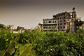
And in the far background, you can see a house that looks like it's in perfect condition.
The thumbnail of the shot actually looked very interesting, however. |
|
| Photographer found comment helpful. |
Home -
Challenges -
Community -
League -
Photos -
Cameras -
Lenses -
Learn -
Help -
Terms of Use -
Privacy -
Top ^
DPChallenge, and website content and design, Copyright © 2001-2025 Challenging Technologies, LLC.
All digital photo copyrights belong to the photographers and may not be used without permission.
Current Server Time: 03/14/2025 05:21:01 PM EDT.