| Author | Thread |
|
|
01/18/2003 05:32:12 PM |
| What a lovely critique! I hope you get to critique my photos in the future, emorgan49! |
|
|
|
01/17/2003 03:13:29 PM |
Awesome! Great job, Ellen on the critique! I know you are insightful, but you catch me off guard still.
Lisae: Excellent work.. I am sorry I was not around to vote on this challenge. It is a fine piece!
|
|
|
|
01/17/2003 12:34:43 PM |
| Wow! What an awesome critique! You made me look at my own work differently. Thanks! |
|
|
|
01/16/2003 10:57:56 PM |
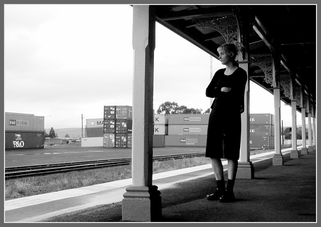
Hello from the Critique club- Here is my (FAR from expert) opinion on your travel picture.
I am at a loss how to "critique" a perfect picture. Critique implies being critical or offering suggestions for improvement. So I will just blab a bit on why I like this photo so much. Don't expect this to be too organized.
First, this is a compositional masterpiece. There are three conflicting parts and each is distinctly diferent visually also. First is the Goth Girl, very very modern and very very out of place. She is all black, the darkest and most "contrasty" thing in the image. Nicely placed on the rules of thirds line. Second there is the modern boring industrial world represented by the squared containers in the background. These are all oriented the other way, laying down , in opposition to the upright girl. They are all a monotone monotonous lower contrast grey tone. Third is the old fashioned train station represented nicely by the filligree above the columns.
Now look at the lines - Perfect. You have the diagonals leading off into the distance, That's where the viewers eye finally travels off too. But the contrary girl looks defiantly in the other direction. The lines of the boxes are all horisontal. The girl is slouchy and bent, the only not straight line in the picture. The negative shapes that are formed by the columns and the roof and the platform are lovley as the diminish in size to the distance. The front post which so nicely divides the picture emphasizes the sense of division as a whole, those three elements of time which do not fi together.
Techincally I can't add anything. the focus and exposure are perfect and both were clearly difficult to achieve. This is an indoor/outdoor exposure, both. The staion is dark but not to dark, the backgroud is bright but not too bright. The foreground (post) midground (girl and station) and the background (containers and even some rural looking scenary) and all in perfect focus. It is sharp without a hard edge, soft without any blur. Black and white was a good choice. Who needs color when the message is so simple.
Emothionally the picture is STUNNING. The alienation of youth, no where to fit in this mundane world. The containerised goods represent the conforming society, row housing, packaged breakfast cereals, bland TV shows, it's all there in those grey boxes. Ms. Goth is too out of place even to protest. She just looks bored and disgusted and trapped. Here she is on an old fashioned train platform, itself a symbol of another age that doesn't fit. Trains? who even thinks about trains in this world of planes and cars? Certainly no one has remodeled that train station in 75 years. Hey are there even any trains running that could take her out? Doesn't look like it. maybe she is waiting for nothing. Nothing here either but hills and more hills. The dilemna of the youth "I don't want to stay here, I don't want to go back and I don't want to move forward". It's amazing that we, any of us, grow up.
Ummmm...maybe, before you hang this in a gallery you could edit out that bright spot behind the front pillar. and send me an invitation to the show!
Message edited by author 2003-01-17 10:46:23. |
|
 Photographer found comment helpful. Photographer found comment helpful. |
Comments Made During the Challenge  |
|
|
01/12/2003 08:46:27 PM |
| yes indeed she's kinda gothy.. gotta love those bootsd.. guess I will bump the score cuase I do like the shot regardless :o) |
|
| Photographer found comment helpful. |
|
|
01/12/2003 12:28:07 PM |
| excellent black and white... I love the composition as well... nice shot :) - setzler |
|
| Photographer found comment helpful. |
|
|
01/11/2003 09:31:16 AM |
| Good story telling scene, Nice balance of grays. the sky is a little to present, but adds to the overall uneasyness of the scene. the only drawback is the presence from top to botom of this pillar that seriously cuts this image in two. 9 |
|
| Photographer found comment helpful. |
|
|
01/09/2003 03:18:40 PM |
I'm a little lost here, I think that she's waiting for a train in the wrong station?
if this were composed a little better ,perhaps the girl sitting on luggage with a bored ,tired of waiting look , oh wait she has that. Great shot except the tracks on the left take you off the page. Maybe cropping it to the closest pillar would help.
|
|
| Photographer found comment helpful. |
|
|
01/08/2003 09:57:45 PM |
| very interesting image. i like the mystery. |
|
| Photographer found comment helpful. |
|
|
01/08/2003 02:37:56 PM |
| I'm not sure what part of this is the strange part, but it is a good picture. I really like the angle of the camera to the platform. Definitely gives it a sense of depth. |
|
| Photographer found comment helpful. |
|
|
01/07/2003 09:06:08 PM |
| Cute stranger. Nice composition. Jakco. 8 |
|
| Photographer found comment helpful. |
|
|
01/07/2003 11:13:41 AM |
| I like the concept, it's the fraiming that bothers me. In my opinion, the shipping containers in the background destroy the mood of this exclent composition, maybe a different angle like from the edge of the platform with the tracks ... but might change the mood of the whole picture. |
|
| Photographer found comment helpful. |
|
|
01/07/2003 10:22:08 AM |
| interesting "retro" feel... |
|
| Photographer found comment helpful. |
|
|
01/06/2003 09:21:07 PM |
| Not a bad shot, maybe having some luggage beside the lady or having her waring some clothing that represents a place that doesn't have trains. Just a thought! |
|
| Photographer found comment helpful. |
|
|
01/06/2003 07:03:07 PM |
Really nice photo, but I can't see the connection to the challenge. sorry!
6 Swash |
|
|
|
01/06/2003 12:44:34 PM |
| Good composition. Perfect in b&w. Border is good too. This is a good photo and I like it very much. High score´s coming. |
|
| Photographer found comment helpful. |
|
|
01/06/2003 12:24:15 AM |
| Meets the ch allenge well, Nice use of contrast and composition. |
|
| Photographer found comment helpful. |
Home -
Challenges -
Community -
League -
Photos -
Cameras -
Lenses -
Learn -
Help -
Terms of Use -
Privacy -
Top ^
DPChallenge, and website content and design, Copyright © 2001-2025 Challenging Technologies, LLC.
All digital photo copyrights belong to the photographers and may not be used without permission.
Current Server Time: 04/27/2025 08:14:19 PM EDT.