| Author | Thread |
Comments Made During the Challenge  |
|
|
09/14/2004 05:13:08 PM |
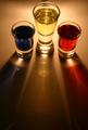
| I think this would have worked better with a non reflective table or surface. Very nice picture. I like the placement. |
|
|
|
09/09/2004 03:14:50 AM |
|
|
|
09/09/2004 02:02:11 AM |
| not a compelling enough subject to capture my interest and hold it. just my opinion. |
|
|
|
09/09/2004 01:20:29 AM |
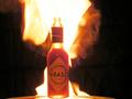
| Reminds me of a beer ad - I expect to see some big text on the right. Light is nice. Exposure is nice. Reflection adds nice effect. The subject is not very interesting, but nice from a technical perspective. |
|
|
|
09/08/2004 06:50:38 PM |
| nice shot, like the contrast. |
|
|
|
09/08/2004 02:24:05 PM |
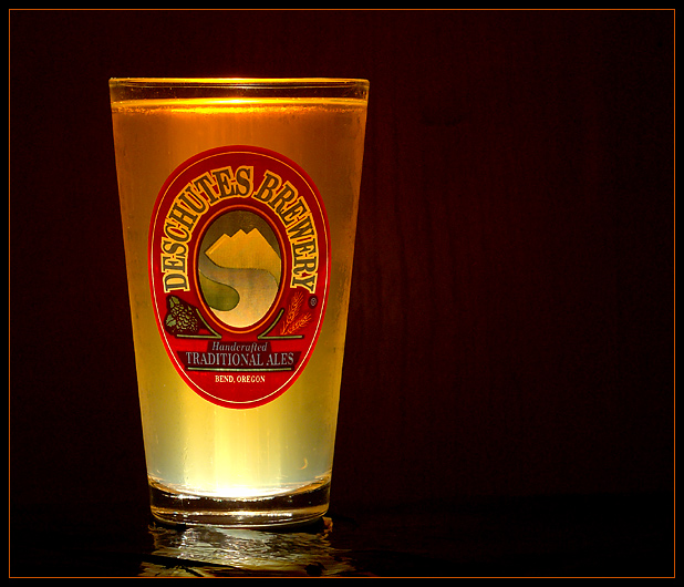
A nice crop. The off-center positioning helps keep it a little unique, yet you've managed to keep the negative space to a minimum. The border actually does add to this picture (and borders on really black/dark or bright/white background photos are a good idea usually). You've lit it very nicely, and have great clarity. I'd play around with the focus a little more. Overall, a great shot, but I feel a certain flatness in the feel. Perhaps a prop of some sort (Darts, a coaster, some kind of pub element) at the side of the cup would have given this photo a touch more life?
|
|
|
|
09/08/2004 12:57:29 PM |
| mmmmmm.. Deschutes :) Home of "Obsidian Stout"... my favorite of the west coast non-micro stouts :) I can't buy it here though because NC has a 6% maximum alcohol content law... it sucks to live in a culturally deprived part of the country :( |
|
Home -
Challenges -
Community -
League -
Photos -
Cameras -
Lenses -
Learn -
Help -
Terms of Use -
Privacy -
Top ^
DPChallenge, and website content and design, Copyright © 2001-2025 Challenging Technologies, LLC.
All digital photo copyrights belong to the photographers and may not be used without permission.
Current Server Time: 03/13/2025 12:54:17 AM EDT.