| Author | Thread |
Comments Made During the Challenge  |
|
|
02/07/2013 10:17:57 AM |
#2
When I initially voted, gave this a 9. The problem with these style of abstracts is my liking is entirely dependent on my mood. Right now I'm not feeling it, but will keep it where is was originally placed.
At least it was different from the rest. |
|
 Photographer found comment helpful. Photographer found comment helpful. |
|
|
02/05/2013 01:04:06 AM |
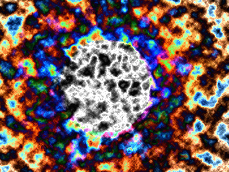
| OK. It is not supposed to look like anything, and it doesn't. The bright colors draw the eye, and the mind tries to attribute meaning to it, when there apparently isn't meaning. I'm assuming the center section is selective desat, but it shows a change happening in the midst of all the other colors. You could also view this as the colors being spun off of the central black & white area. Very successful use of the abstract to communicate the message. |
|
| Photographer found comment helpful. |
|
|
02/02/2013 03:43:05 PM |
| Pretty colors, but I don't get the connection to the biblical scene. Very impressionistic for a challenge that needs to be more literal in my opinion. |
|
| Photographer found comment helpful. |
Home -
Challenges -
Community -
League -
Photos -
Cameras -
Lenses -
Learn -
Help -
Terms of Use -
Privacy -
Top ^
DPChallenge, and website content and design, Copyright © 2001-2025 Challenging Technologies, LLC.
All digital photo copyrights belong to the photographers and may not be used without permission.
Current Server Time: 03/10/2025 08:53:48 PM EDT.