| Author | Thread |
Comments Made During the Challenge  |
|
|
09/21/2004 12:45:16 PM |
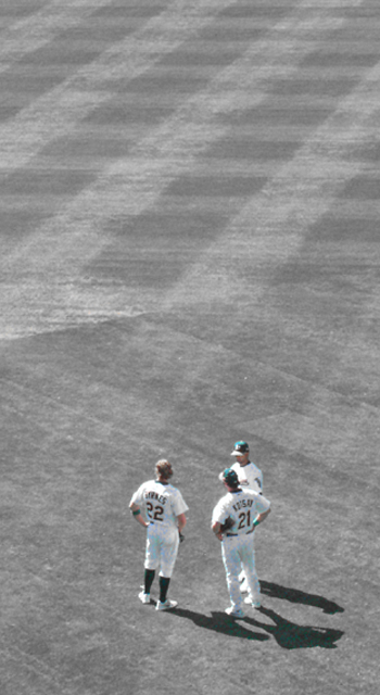
| The composition is good, but it's missing the green. |
|
 Photographer found comment helpful. Photographer found comment helpful. |
|
|
09/20/2004 10:34:59 PM |
| Great art shot. Simple and effective, although it doesn't have much action. |
|
| Photographer found comment helpful. |
|
|
09/20/2004 04:00:00 AM |
| too much space for me - looses impact |
|
| Photographer found comment helpful. |
|
|
09/18/2004 02:53:22 PM |
|
| Photographer found comment helpful. |
|
|
09/17/2004 10:20:48 PM |
| A little too much field. Nice shot. |
|
| Photographer found comment helpful. |
|
|
09/17/2004 10:14:58 PM |
| Left alone this would have been a really cool shot. As it is it ain't too hot.. |
|
| Photographer found comment helpful. |
|
|
09/17/2004 09:02:14 PM |
| Nice photo! The negative space and shadows make this interesting. |
|
| Photographer found comment helpful. |
|
|
09/17/2004 03:32:55 PM |
| This photo is lovely - it's made interesting to me by the use of negative space above the players and the pattern in the space created by the cut grass. The players shadows create an interesting contrast too. I'm not too keen on the graininess of the photo, however, though I have to say I have similar problems when taking zoom photos with my camera on high ISO settings. |
|
| Photographer found comment helpful. |
|
|
09/17/2004 12:32:50 PM |
| This is a really nice composition. Love the huge "canvas" of grass with the three little figures at the bottom. Wish there was a little more focus on the players though. Good luck with the challenge. |
|
| Photographer found comment helpful. |
|
|
09/17/2004 05:15:16 AM |
|
| Photographer found comment helpful. |
|
|
09/17/2004 04:07:36 AM |
| I love this image. I believe it has been artistically executed and produced. The sense of space is awesome and the contrast to the "action" element is brilliant. You have really emphasized the isolation of the subjects through the starkness of the way you have treated the colour. This is inspirational. Thank you for this entry. |
|
| Photographer found comment helpful. |
|
|
09/16/2004 10:32:53 PM |
| I voted this low mainly because there was no action taking place. I also don't like the color. Looks almost B&W except for the green ball caps, and there is too much dead space IMO. |
|
| Photographer found comment helpful. |
|
|
09/15/2004 11:28:08 PM |
| i'm not such a fan. the technical quality would have to be pretty incredible to make this stand out. the composition and concept aren't bad though. keep exploring! |
|
| Photographer found comment helpful. |
|
|
09/15/2004 12:33:10 PM |
| Looks pretty washed out to me. Perpahps a bump in the saturation would have helped. |
|
| Photographer found comment helpful. |
|
|
09/15/2004 11:24:57 AM |
| Ya should have left the grass green, or made it all black and white. The desaturation killed it for me. |
|
| Photographer found comment helpful. |
|
|
09/15/2004 09:05:06 AM |
| too washed out colorwise for my taste - I like the shadows and the grid pattern though |
|
| Photographer found comment helpful. |
|
|
09/15/2004 06:28:01 AM |
| This is a really nice picture, but I think I would prefer it in full color. I like the composition of the final image here. |
|
| Photographer found comment helpful. |
|
|
09/15/2004 03:33:09 AM |
| Desaturation gives a nostalgic feel. Good job! |
|
| Photographer found comment helpful. |
|
|
09/15/2004 02:56:00 AM |
|
| Photographer found comment helpful. |
Home -
Challenges -
Community -
League -
Photos -
Cameras -
Lenses -
Learn -
Help -
Terms of Use -
Privacy -
Top ^
DPChallenge, and website content and design, Copyright © 2001-2025 Challenging Technologies, LLC.
All digital photo copyrights belong to the photographers and may not be used without permission.
Current Server Time: 03/12/2025 09:51:23 AM EDT.