| Author | Thread |
|
|
01/15/2003 06:49:01 AM |
| Oh, by the way, let me encourage you to vote more often and also to leave more comments. It really helps the others and the site. |
|
|
|
01/14/2003 10:48:23 PM |
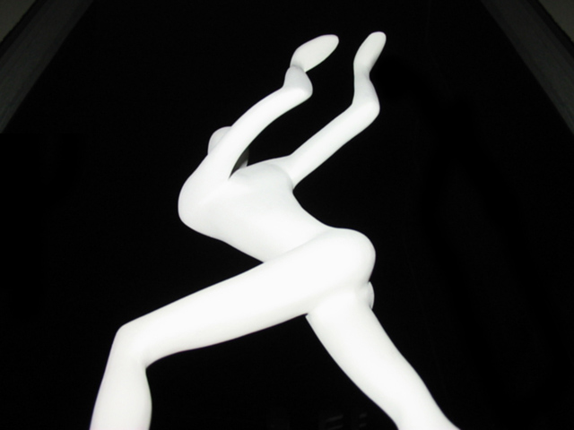
Critique Club critique:
Composition/Content: Very nice framing of the figurine and nice choice of subject. Nice use of white against black for a simple but striking image.
Lighting: The flash accentuates the contrast and maybe too much. Flash sometimes "flattens" out an image. I think reflected light or side light would have given this figure more depth and because of that more life. I would have still made it high contrast just different angle on the light.
Background: The upper corners are slightly distracting because they are the only things in the background that aren't black.
Camera Work/Technical: Excellent camera angle.
Digital Processing: I've seen some of my images have the gradients like the upper corners here, and they were caused by over processing the color levels and/or saturation. I don't know if that's what caused your gradients or not.
My Opinion: I like the image and think it is well done. I don't think upper corners were the reason for an average score. The image is striking but could use more depth with different lighting to make it more three dimensional.
|
|
|
|
01/13/2003 12:04:03 AM |
| I thought it was really cool too, but most people didn't agree I guess. |
|
Comments Made During the Challenge  |
|
|
01/12/2003 11:47:15 PM |
| far out. lady looking over my shoulder just said "that's really cool," we agree. |
|
|
|
01/10/2003 03:27:57 PM |
| Cool shot (of someone else's art, I have a slight problem with that). The walls/beams/columns on either side seem sort of distracting. Very strong contrast (I like that!) 6 Swash |
|
|
|
01/09/2003 04:36:59 PM |
| Yargh, I am sad that you offered free publicity for this subtly racist song! I know that now it's part of our popular culture, but it's offensive to Egyptians... who walk just like everyone else. Your photo is interesting in it's own right, but I wish you had chosen "Walk This Way" or something else as your song. |
|
|
|
01/08/2003 01:58:16 AM |
Just too funny, the statue sure looks like it is doing the dance. I wondered about the diagonal lines at the corners. They don't hinder much but don't help either. I like the contrast of the white with the pitch black background. 6.
Take my comments for what they are worth for I am just a novice with a new camera. Dodo |
|
|
|
01/07/2003 05:54:54 AM |
| Great shapes - seems to suit the song title perfectly. |
|
|
|
01/07/2003 12:54:51 AM |
| I don't think you got the correct pose for the arms. |
|
|
|
01/06/2003 09:31:06 PM |
| Awesome abstract shot. Great angle. |
|
|
|
01/06/2003 09:12:10 PM |
| beautiful black and white! |
|
|
|
01/06/2003 12:04:40 PM |
| the figurine is cool, i would've crop the wood that shows... |
|
|
|
01/06/2003 11:57:27 AM |
| Neat picture, but frame in the background is distracting. |
|
Home -
Challenges -
Community -
League -
Photos -
Cameras -
Lenses -
Learn -
Help -
Terms of Use -
Privacy -
Top ^
DPChallenge, and website content and design, Copyright © 2001-2025 Challenging Technologies, LLC.
All digital photo copyrights belong to the photographers and may not be used without permission.
Current Server Time: 03/12/2025 07:54:03 AM EDT.