| Author | Thread |
|
|
04/08/2013 12:28:14 PM |
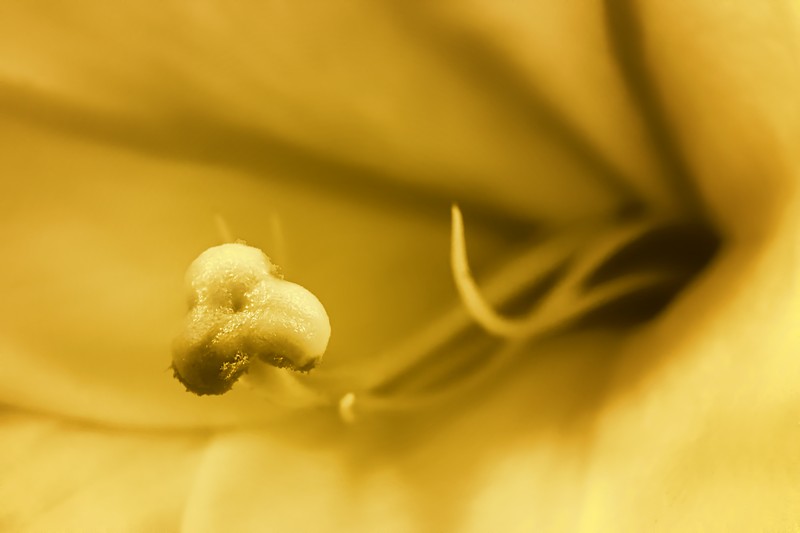
| On this one, I know what I'm looking at, but it just looks....gooey or something. Not sure how to describe it, but it isn't really appealing. Again, on this one, I think the toning might have been too strong. My vote got scrubbed, but I think I gave it a 4 or 5. |
|
 Photographer found comment helpful. Photographer found comment helpful. |
|
|
04/08/2013 09:56:02 AM |
I would agree with  Melethia... The in focus area doesn't have enough [insert smart photography something here] to hold attention... There's just not enough contrast to make it stand out. Looking at the vote breakdown, no one thought it was bad. just "meh". Melethia... The in focus area doesn't have enough [insert smart photography something here] to hold attention... There's just not enough contrast to make it stand out. Looking at the vote breakdown, no one thought it was bad. just "meh". |
|
| Photographer found comment helpful. |
|
|
04/08/2013 01:21:00 AM |
| The toning is fine! I think the biggest issue is that the in-focus part of the flower is kinda "eh". It just isn't particularly attractive. Not sure if it is different in color? Your FS, on the other had, is simply gorgeous! Would have worked well for duotone, too. |
|
| Photographer found comment helpful. |
Home -
Challenges -
Community -
League -
Photos -
Cameras -
Lenses -
Learn -
Help -
Terms of Use -
Privacy -
Top ^
DPChallenge, and website content and design, Copyright © 2001-2025 Challenging Technologies, LLC.
All digital photo copyrights belong to the photographers and may not be used without permission.
Current Server Time: 03/10/2025 10:28:10 PM EDT.