| Author | Thread |
|
|
10/13/2004 12:50:11 AM |
| i thought this was a REALLY REALLY great shot, i wonder why it scored so low, definately one of my favorites.. |
|
|
|
10/12/2004 01:51:23 AM |
| great photo. period. philosophical, esthetic, ironic, even iconic. |
|
|
|
10/08/2004 04:50:22 PM |
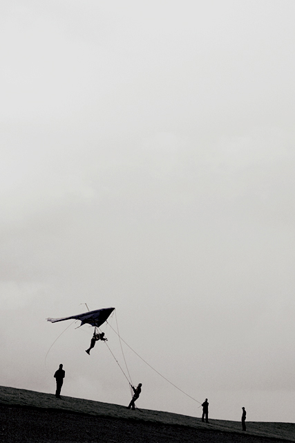
despite the low ranking - this is a killer photo.
|
|
|
|
10/08/2004 11:54:43 AM |
I think I've used up all the superlatives I'm capable of for this remarkable photograph, but I need to argue for your original title.
It is this very title which charges the image with an amusing hyperbolic surreality measuring a considerable range given by the two aesthetic extremes present here: the dynamics of the spectacle at the bottom of the frame (both bold and fine) and the minute size of it, never mind the contrast between the expansive monochrome/-tone treatment, which is almost a 'gravity', and an appearance of incidental playfulness for what must have presented the actual human subjects depicted here with a dramatically 'real' challenge involving variable degrees of physical effort and attention on their part.
The detached, philosophical amusement so deliberately and deliciously invoked and applied here is not something I can, easily, sacrifice at the altar of a lesser deity. :-)
It is a wonderfully 'light' title, utterly appropiate for the universally small drama it points, in human history and under the sky.
|
|
|
|
10/08/2004 05:23:50 AM |
Thanks for all the votes and comments.
Although I hoped it would do better I realized this photo wouldn't score high, because it's a photo that one either likes or not. I submitted it anyhow, because I think it's a unique catch and a very interresting image overall. For me, that's worth more than a high ranking.
Personally I like this image very much, because its's kind of a "story-telling" image and the viewer can make up his own story. There are several ways to look at this photo and the mixed comments are a proof of that.
I titled his photo "Megalomania" because that's what I thought describes the photo best. "All we are is dust in the wind" as John Setzler mentioned in his comment might be a very good title too though. Funny I didn't think of that myself, because it's my favorite song :)
I've also been doubting if I should tittle it "Leonardo" or "Wright brothers" because of the old-fashioned pioneer-feeling of the image and I'm glad that others had that feeling as well.
|
|
|
|
10/08/2004 02:48:32 AM |
| one of my favorites of the challenge. great capture! should have finished much higher. |
|
|
|
10/08/2004 12:44:14 AM |
This is the one photo that got away! I definitely had this as a top 5 finisher, but what can you do?
Beautiful, beautiful, beautiful... |
|
Comments Made During the Challenge  |
|
|
10/07/2004 11:11:18 PM |
| This is one of the best uses of negative space I've seen, and fantastic post-processing. 9/ |
|
|
|
10/07/2004 10:37:25 PM |
| I sure didn't have this much help learning to fly or.... take pictures. |
|
|
|
10/07/2004 08:43:49 PM |
| Excellent use of negative space, it helps convey freedom to the viewer. (9) |
|
|
|
10/07/2004 04:46:56 PM |
| Icarus taking no chances on his second attempt. Just my kind of framing. Good job |
|
|
|
10/07/2004 12:36:42 PM |
| Just love this image!! Negative space is well used. Portrays the pioneering days of flight. Great use of desat. 8. |
|
|
|
10/07/2004 10:12:38 AM |
| this is a fun image. really enjoy the bw and the negative space. wonderful composition. i really don't understand the title. |
|
|
|
10/07/2004 01:04:42 AM |
| Maybe this man had grand dreams of flying into the sky suggested by the negative space.Other than that, I just see five people working to get a glider into the air. Composition is good by putting the negative space in front of the glider (mostly). 6 |
|
|
|
10/06/2004 02:46:41 PM |
| Great title, great concept. The people look so small, like insolent ants, trying to fly. The effect is strenghten by the fact that you left a lot of sky. I would increase contrast a little bit to make it more dramatic - but I'm not sure about it. Just an idea. |
|
|
|
10/06/2004 04:51:03 AM |
| Great picture but the sky is a bit dull. |
|
|
|
10/06/2004 02:24:50 AM |
| A very nice subdued tone but with highly exciting action. The great ceiling height give breath to the experience. While it does not have a high impact it does deliver a unique interpretation of showing an exhilirating past time with the force of sheer simplicity. Bumping up to 7 |
|
|
|
10/06/2004 12:13:04 AM |
| In just a few short seconds this photo has grown on me and I like it very much. Has a historical feel to it. Cropping is impeccable and the height of the image, as well as, the dark solid earth really give this picture great impact. Very very well done. 10 |
|
|
|
10/05/2004 09:54:29 PM |
|
|
|
10/05/2004 03:47:13 PM |
| Well, negative space. I think you have got many comments about it. I often like some negative space but I think this is a bit to much. |
|
|
|
10/05/2004 11:19:51 AM |
| Looks like fun, did you try it too? For me the negative space in this just doesn't quite work. |
|
|
|
10/05/2004 11:15:12 AM |
|
|
|
10/05/2004 09:55:46 AM |
| I like the tension created by positioning the subject so low in a vertical format. However, I find the sky is a bit too 'blah' to carry so much weight in the composition. |
|
|
|
10/04/2004 11:45:46 PM |
| Unusual placement -- I like it! |
|
|
|
10/04/2004 05:50:06 PM |
| Great shot of big children at play. I love your composition and the b/w for this image! |
|
|
|
10/04/2004 08:10:52 AM |
| I like the negative space and the feeling of action in your picture. All that room above the subject makes me feel that is where he wants to be. Good shot |
|
|
|
10/04/2004 06:45:55 AM |
| I am sorry I find this image not particularly appealing. The large empty space does not work for me because it is just a flat and dull grey, I would have understood it better if it emphasised the enormous spcae around us, for example by using colors and having some great clouds in there. Then I also would have understood the title, which does not seem to fit at the moment. And finally I find the distance to the persons too big. A shot closer and more from underneath would have emphased the height, the ambition to fly. etc. |
|
|
|
10/04/2004 05:31:01 AM |
| A silhouette needs other detail or splash of color to really bring it off. The subject is interesting but there is too much gray nothingness. A good cropping would enhance this for me. |
|
|
|
10/03/2004 11:33:16 PM |
| The use of negative space on this shot is very well done and I love the subject matter, are they people flying? It looks like fun! The overall shot seems to lack just a touch of contrast to me though, a 9 |
|
|
|
10/03/2004 10:08:11 PM |
| A superb example. I really like your composition and choice of B/W. A classic in the making, thanks for letting us enjoy. 10 |
|
|
|
10/03/2004 08:34:45 PM |
| 10. I love the use of negative space in this. It really draws you into the subject. Great choice of BW, too. |
|
|
|
10/03/2004 06:44:37 PM |
| Too much sky. Great idea. |
|
|
|
10/03/2004 04:53:40 PM |
| It's a good photo, but not that interesting. I like the expanse of sky, but the gray tones are a bit much. I wonder what this looks like in color... Anyway, I like it, but not very high on the WOW factor... Thanks, though! |
|
|
|
10/03/2004 04:11:13 PM |
| Wow, thats a lot of sky. I would crop in just a tad, otherwise i love the silhouettes.7 |
|
|
|
10/03/2004 03:50:43 PM |
| megalomania? I acn't get past this title. I do like the negative space, the subtle detail in the silhouettes and the placement of the horizon and men is nice, and the subject is interssting. |
|
|
|
10/03/2004 11:44:42 AM |
| great moment captured. it has almost a Wright Brothers feel to it. I like the mount of sky you included to enhance the sense of scale but it might have worked a little better with less. |
|
|
|
10/03/2004 08:43:10 AM |
| The fantasy of defying gravity? Nicely done. A little to much dead space for me though. |
|
|
|
10/03/2004 08:33:45 AM |
| wow interesting photo :D hehehe looks like a very interesting sport and a gr8 photo too! though IMHO i believe there is too much sky and overbalances (if thats a word) the composition of this photo... possibly tone down the vastness of the sky a tad and i believe it would improve this photo greatly |
|
|
|
10/03/2004 08:00:18 AM |
| Too much sky, but the trick of having this open as just a grey box was excellent. |
|
|
|
10/03/2004 06:46:17 AM |
| An intriguing shot... I don't quite understand what's happening. Is this a man attached to a kite? Is this a hanglider being flown as a kite? Why is this megalomania? Great composition, but I wish there was more detail in the sky. 7 |
|
|
|
10/03/2004 04:04:21 AM |
| Interesting use of negative space. |
|
|
|
10/02/2004 07:28:49 PM |
| Great capture. Man Vs. Nature :-) |
|
|
|
10/02/2004 06:45:10 PM |
this is my top choice of the bunch.
very simple, and complicated at the same time.
tells a number of stories.
good luck - 10
( i thought i had already left this comment, but it didn't show when i was reviewing my votes ) |
|
|
|
10/02/2004 04:32:02 PM |
| I like the use of negative space here, think the B&W option is good but I don't feel the shot really grabs my attention. 6 |
|
|
|
10/02/2004 04:23:05 PM |
| I really like the empty space, subject, simplicity. I bet this would have been breathtaking in color. 9. |
|
|
|
10/02/2004 03:25:46 PM |
| Great use of negative space. Reminds me of the old movie, Those Amazing Men and their Flying Machines. |
|
|
|
10/02/2004 01:44:57 PM |
Heh, had to look up that word.
meg·a·lo·ma·ni·a
1. A psychopathological condition characterized by delusional fantasies of wealth, power, or omnipotence.
2. An obsession with grandiose or extravagant things or actions.
Cool image, it feels very 1900s. The huge space above the people really gives some perspective that a tight crop wouldn't give. |
|
|
|
10/02/2004 01:39:18 PM |
| Very intriguing... excellent mood as well. I like the negative space here and the way it supports the 'theme' of this image. "All we are is dust in the wind" :) We do have grand ideas and aspirations to be more :) Great work... = 10 |
|
|
|
10/02/2004 11:54:57 AM |
| I think your use of negative space here is a little extreme. Perhaps croping the shot to landscape format could help relieve that excess space. Other than that, I like the silouhette and it is a very good capture of a great moment. |
|
|
|
10/02/2004 08:28:29 AM |
| Amazing photo. The sky's the space to go. Or so it seems here. I love the composition. It's brilliant |
|
|
|
10/02/2004 08:19:39 AM |
| I like the subject and the slant of the hill, but I think the shot would've worked better if it were a clear day and the hill was brighter. 6 |
|
|
|
10/02/2004 07:45:24 AM |
| i love the negative space, and the simple silhouettes. looks fun too! |
|
|
|
10/02/2004 02:29:08 AM |
Not really sure about this image it is stricking yet dull
I am trying to make my mind up about this
It is cleverly positioned in the frame very different and no real detail yet it says so much I think I find this image clever |
|
|
|
10/02/2004 12:53:41 AM |
|
|
|
10/01/2004 10:46:50 PM |
| This has too much open space up at the top for my taste but an interesting subject..wish could be in closer to the action though |
|
|
|
10/01/2004 08:25:33 PM |
| not quite sure about the title. Stark image and composition but perhaps not simple enough..extra figures distract. Being cheeky to my betters, might I suggest just one lower figure...kind of like a kite flyer? |
|
|
|
10/01/2004 07:53:49 PM |
| I really like the feeling of smallness you give your subjects here, and the implication that they are "flying a kite" is great too. There's just some factor missing in it that I can't put a finger on. Perhaps it's the sky.. the overcast is just too static for me, although the shading from your silhouetted to the gray, to the lighter gray and white in the corner helps. Still, it's a 7 from me, as it just doesn't "pop" for me. |
|
|
|
10/01/2004 06:34:43 PM |
Outstanding, simple, surreal - a perfect example of classic photography.
I feel profoundly exhilarated by this unexpected find: a timeless subject which never ceases to excite the imagination, a distinctly deliberate composition, which makes cosmic child's play out of our endeavors, a wonderful detached perspective, something rarely present in contemporary photography.
The dynamic between the near-silhouetted men, accentuated by both intervals and lines is deliciously contrasted with the slumped pose of the flyer hanging from his precarious perch. Even the exposure, trimmed to the sky, where the action is, renders a fine gradation of tones -tangibly.
The portrait format, apt to more than this purpose, employs the whole vertical expanse of sky (all the gauze-like subtlety of it) to counter-weigh the silhouetted base of the image. The effect, although not new, has been so nearly forgotten that, at least to me, seeing it resurrected here so simply feels dramatically new and fresh.
The title, too, moves me like a 24-karat surrealist hyperbole :-), nevertheless distinctly consistent with the visual manner of this remarkable capture.
I have not given out a 10 in about a year or so. Here it is.
-Use it wisely. ;-) |
|
|
|
10/01/2004 06:15:52 PM |
| I really like all of that negative space. The silhouettes are very nice as well (7). |
|
|
|
10/01/2004 05:51:46 PM |
| This is an interesting photo, but I gave it a 5 because I thought there was too much empty space at the top and the actual image was too small in the photograph to suit my particular tastes. |
|
|
|
10/01/2004 05:41:59 PM |
| nice use of negative space - I'm not making the connection with the title (no deduct) - a little too low-key tonally for me |
|
|
|
10/01/2004 03:21:48 PM |
| This is so cool- I love that the horizon is sloped and there's a great use of negative space. The black and white is great and I love how there's such teamwork and that guy looks like he's having fun. Great job 10 |
|
|
|
10/01/2004 02:45:22 PM |
| I'm curious to see if you get comments on having too much sky. I like it, and commend you for subtle rule-breaking. The composition creates a feeling of the glider pilot's feel as he heads for the wide open sky, as opposed to focusing on the tethers to earth. This is a great image! |
|
|
|
10/01/2004 02:31:59 PM |
| I like the use of negative space here, though the sloped ground seems to throw things off a little bit, as it fools with my sense of horizon. As a result, the people appear to be leaning a bit unnaturally. Also, I would have liked to see either a more intentional silhouette approach with less detail on the people, or a bit more exposure on them to bring out some of the variation. Right now, the foreground elements get caught between the extremes of silhouette and enough exposure to see detail. |
|
|
|
10/01/2004 12:54:51 PM |
| I am a fan of the creative use of negative space. I would probably crop about an inch from the top for this one ... for utility (so when your viewers with smaller monitors open this page, you see the picture right away, and not just a gray space). |
|
|
|
10/01/2004 12:20:32 PM |
z
Message edited by author 2005-07-12 08:14:33. |
|
|
|
10/01/2004 12:13:45 PM |
| Cool idea, nice use of neg space. -8 |
|
|
|
10/01/2004 10:51:51 AM |
| I am a fan of negative space and silhouettes, and in this case you have very interesting silhouettes, however I think there is too much sky with no detail. If the sky had better defined clouds to make it more dramatic, I think this crop would work, as it does suggest we are tiny as humans and there is a huge expanse of space for us to explore above us, but I think in this case, a landscape crop on the people, cutting off just above the glider, would look better. 7 |
|
|
|
10/01/2004 08:19:20 AM |
| looks like fun ... i like all the dead space on top ... 10 |
|
|
|
10/01/2004 05:15:47 AM |
| interesting pic, good capture - well done :) |
|
|
|
10/01/2004 03:46:10 AM |
|
|
|
10/01/2004 01:51:47 AM |
| Great use of negative space, This looks like alot of fun :) Good luck |
|
|
|
10/01/2004 01:48:23 AM |
very nice but
too much sky 8 |
|
|
|
10/01/2004 01:02:10 AM |
| I really like the framing on this. showing so much sky above them really makes it feel like they have a long way to go. |
|