| Author | Thread |
|
|
07/05/2013 04:08:28 PM |
Critique Club Review:
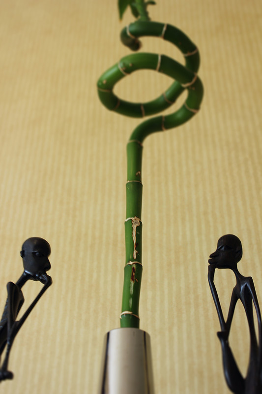
Color Saturation and Hue: Colors and hues are realistic and seem accurate for the subject displayed.
Brightness and Contrast: The image could benefit from more light, and better lighting. The figures do have detail, and they do appear to be thinking. But the brightness of the background, and the busy stripes, distract the viewer.
Focus and depth of field: There is a sharp area in the image, but the relatively shallow depth of field hurts the image. The image is soft in more areas than it is sharp.
Personal observations. I find myself wanting to see more of the two figures. They seem unnaturally cut off by the edge of the frame. Lowering the plant in the center could help as well. The chrome object is a little distracting for me. As already suggested, a different crop is an idea to try. More of the two figures, and then crop right at the top of the upper spiral. The bud and leaves above the top of the spirals distract a little as well.
All in all good bones in this picture. I would like to see it done again, with some changes incorporated. It could make quite an entertaining poster. |
|
Comments Made During the Challenge  |
|
|
06/26/2013 03:06:18 PM |
| Great idea, not sure about the crop. |
|
 Photographer found comment helpful. Photographer found comment helpful. |
Home -
Challenges -
Community -
League -
Photos -
Cameras -
Lenses -
Learn -
Help -
Terms of Use -
Privacy -
Top ^
DPChallenge, and website content and design, Copyright © 2001-2025 Challenging Technologies, LLC.
All digital photo copyrights belong to the photographers and may not be used without permission.
Current Server Time: 03/14/2025 09:41:38 AM EDT.