| Author | Thread |
|
|
05/26/2006 03:39:16 PM |
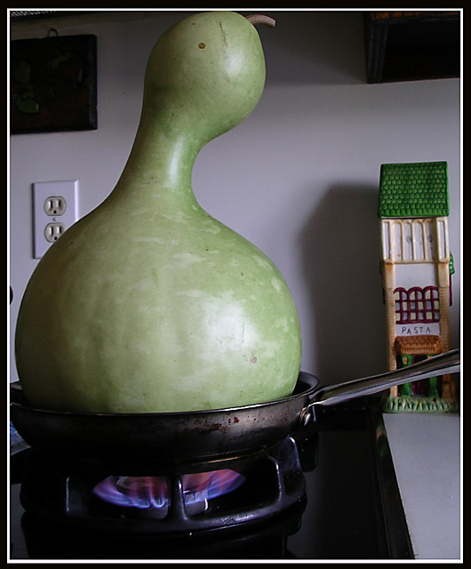
| Ha!! This is freakin' hilarious!! I wasn't a member during this challenge so this is my first view of the monster gourd. It's a masterpiece. I would have voted an 8 for making me laugh so hard. |
|
 Photographer found comment helpful. Photographer found comment helpful. |
Comments Made During the Challenge  |
|
|
10/04/2004 07:22:36 PM |
| Very cool. Nice perspective. |
|
| Photographer found comment helpful. |
|
|
10/02/2004 02:49:23 PM |
|
| Photographer found comment helpful. |
|
|
10/02/2004 01:31:38 PM |
| Hehe :) good humour. Still seems you made border after croping so few main parts of picture are cutted now. Well and few things at bacground are distracting too. But ligh of fire is real nice. |
|
| Photographer found comment helpful. |
|
|
10/02/2004 11:03:52 AM |
| I like it, but there's too many distracting things in the background: the pasta house, the electric outlet, the black vent(?), etc. |
|
| Photographer found comment helpful. |
|
|
10/02/2004 02:04:48 AM |
| That electric plug is glaringly distracting. This looks crazy (in a good way) But everything in the background is distracting. |
|
| Photographer found comment helpful. |
|
|
09/30/2004 07:31:45 PM |
| made me laugh. the outlet is the 1st pitfall, the crookedness the 2nd |
|
| Photographer found comment helpful. |
|
|
09/30/2004 06:19:06 PM |
| Composition is good. The effect is there! I would have given a 10 if it didn't have the plug on the left side and there's not the shadow on the small pasta house.. |
|
| Photographer found comment helpful. |
|
|
09/30/2004 11:31:16 AM |
| If you had blocked out the background (the outlet, pasta thingie, white counter) and centered this, and pulled back a bit so it's not so crooked, this coulda been great! I like the idea...and that gourd is crayzee! |
|
| Photographer found comment helpful. |
|
|
09/30/2004 01:50:51 AM |
| That would be so awesome if the background was less distracting. A plain black or white background would work wonderfully. |
|
| Photographer found comment helpful. |
|
|
09/29/2004 10:54:56 PM |
the crop seems too tight on the top and it seems tilted left to me
I might have tried a more shallow dof to blur some of the details in the bg |
|
| Photographer found comment helpful. |
|
|
09/29/2004 10:03:13 PM |
I really liked this image. I hope you squash the competition! :)
|
|
| Photographer found comment helpful. |
|
|
09/29/2004 08:38:53 PM |
| I think its a funny idea. Well done. The frame however interferes with the main object in the photo. I bet there will be lots of left overs. :) |
|
| Photographer found comment helpful. |
|
|
09/29/2004 02:26:30 PM |
|
| Photographer found comment helpful. |
|
|
09/29/2004 10:03:16 AM |
I love this idea. The background seems a bit distracting and the crop could have been a hair wider to get the top of the gourd and the side of the pan.
Overall well done imo |
|
| Photographer found comment helpful. |
|
|
09/29/2004 08:02:36 AM |
|
| Photographer found comment helpful. |
|
|
09/29/2004 02:20:31 AM |
| oh my! that's what we call gazunta! |
|
| Photographer found comment helpful. |
|
|
09/29/2004 01:34:37 AM |
| Cute idea, but I think the background is too distracting. |
|
| Photographer found comment helpful. |
Home -
Challenges -
Community -
League -
Photos -
Cameras -
Lenses -
Learn -
Help -
Terms of Use -
Privacy -
Top ^
DPChallenge, and website content and design, Copyright © 2001-2025 Challenging Technologies, LLC.
All digital photo copyrights belong to the photographers and may not be used without permission.
Current Server Time: 03/13/2025 06:46:15 AM EDT.