| Author | Thread |
|
|
01/26/2003 11:19:26 PM |
Gina, Greetings from the Critique Club };-)
Initial thoughts
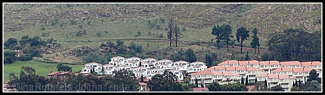
Interesting composition, meets the challenge, brightness and focus seem a bit off
Composition/ Content
I like the composition and the panorama feel of the shot. It is certainly interesting with the change in orientation of the houses. It seems to match the title well.
Background
Although I like the panorama feel, a bit more of the background of the hill may have reinforced your title a bit.
Camera Work - Technical
Focus seems a little bit soft and if possible, it would have been nicer to get a little closer to the interesting houses.
Digital Processing - Technical
I noticed that your comments were mostly about soft focus. I don't know if this was straight from the camera but it certainly could use a little post processing. It is a little small and you only used 110kb of the 150kb allowed in file size. This in itself would have sharpened it up. It still needs a little sharpening and some contrast and saturation could have made this a really sharp shot.
Fits The Challenge
Definitely fits the challenge well.
My Opinion On The Photo
I originally scored this shot a seven. That may have been a bit high but I liked the way it matched the title of your shot. I think if it was a bit bigger and a bit sharper and brighter you would have really scored well. Good job, and keep up the good work.
I would be happy to talk further about this shot if you would like to contact me.
DougPaz
|
|
 Photographer found comment helpful. Photographer found comment helpful. |
Comments Made During the Challenge  |
|
|
01/19/2003 10:17:31 PM |
| Excellent choice of framing. |
|
| Photographer found comment helpful. |
|
|
01/17/2003 05:31:42 AM |
| Neat shot, seems just a bit soft on focus. Probably could have used a bit more than the 110kb of the 150 allowed to sharpen it some. |
|
| Photographer found comment helpful. |
|
|
01/15/2003 12:32:52 PM |
| You get extra points for cropping to a real landscape format. |
|
| Photographer found comment helpful. |
|
|
01/15/2003 07:06:45 AM |
| great use of repetition and cropping. |
|
| Photographer found comment helpful. |
|
|
01/15/2003 03:09:48 AM |
| Would've rated it higher if it was a little broader an image, or even taller. 6 |
|
|
|
01/14/2003 10:46:16 PM |
| Nice panaroma. The border also works well with the white buildings. Colours are nice and simple and it shows the urban sprawl well. |
|
| Photographer found comment helpful. |
|
|
01/14/2003 01:24:55 PM |
| Interesting. Its kind of hazy. Too bad about that. Hard to get good shooting weather this time of year. - Inspzil |
|
|
|
01/14/2003 07:25:52 AM |
| Wow, those houses are packed tightly! |
|
|
|
01/13/2003 11:05:24 AM |
| I would really like to see more of this scene. For me, the tight vertical crop hurts this image since the sharpness just isn't there. But, wow... what a pretty town! (6) |
|
| Photographer found comment helpful. |
Home -
Challenges -
Community -
League -
Photos -
Cameras -
Lenses -
Learn -
Help -
Terms of Use -
Privacy -
Top ^
DPChallenge, and website content and design, Copyright © 2001-2025 Challenging Technologies, LLC.
All digital photo copyrights belong to the photographers and may not be used without permission.
Current Server Time: 03/13/2025 02:42:47 AM EDT.