| Author | Thread |
|
|
01/20/2003 12:13:51 AM |
A visit from the critique club :)
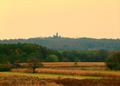
Hmm, I like this image, it's pretty well executed but I would say it does not jump out at me as "landscape" it's more of a "seascape+cityscape" since emphasis here seems to be on the water and the fishing house(?).
Composition wise, I think the foreground is a bit distracting here. The anchoring the frame to that didn't do the photo justice as I would have rather seen the house not cut off. Another thing I noticed is that you did not place the horizon directly in the center, it's definitely a good idea but I think you should have framed more sky and less water.
It also looks a bit flat and grey. It looks like this was an overcast day so it's kind of hard to liven up a scene that's like that.You really can't alter the landscape at will so I would not worry about it too much.
It's definitely sharp and I like a lot of detail in the house.
Message edited by author 2003-01-20 00:16:26. |
|
 Photographer found comment helpful. Photographer found comment helpful. |
Comments Made During the Challenge  |
|
|
01/17/2003 06:37:48 PM |
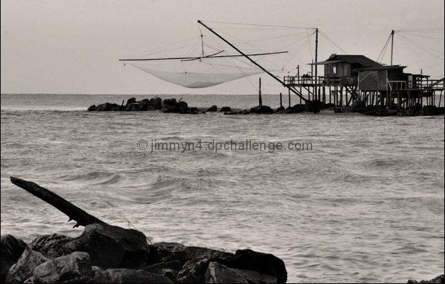
| This shot feels too dark. Maybe could be brightened up with Photoshop. Would have been a great shot on a sunny day with a blue sky. Still a nice composition. 7 |
|
| Photographer found comment helpful. |
|
|
01/15/2003 03:26:31 AM |
|
| Photographer found comment helpful. |
|
|
01/15/2003 12:59:19 AM |
| This shot sure shows something different, but I like that. I dont like black and white much, but it adds a lot to this shot. The rock formation in the foreground really adds to the shot. The only part I would change if at all possible would be to get rid of the tiny bit of rock on the lower right corner, but it does nothing detrimental to the effect. 8. |
|
| Photographer found comment helpful. |
|
|
01/14/2003 06:24:43 PM |
| Wow, what is that? Your photograph exudes wild, turbulent seas. The b & w accentuates that. Interesting. |
|
| Photographer found comment helpful. |
|
|
01/14/2003 12:03:00 PM |
| Landscape-Natural Inland Scenery? |
|
| Photographer found comment helpful. |
|
|
01/14/2003 09:20:13 AM |
| Great composition. Perfect in b&w. Perhaps you should have cropped away the stones in the lower right corner? Interesting. Great shot so high score. |
|
| Photographer found comment helpful. |
|
|
01/14/2003 05:40:15 AM |
oh my goooooodnesssss.....
10. |
|
| Photographer found comment helpful. |
|
|
01/13/2003 11:32:04 PM |
| Not 100% a landscape, as the structure is the primary subject. But a superb photo. I hope no one makes the comment "theres no land" If they do, ignore them. |
|
| Photographer found comment helpful. |
|
|
01/13/2003 07:13:03 PM |
|
| Photographer found comment helpful. |
|
|
01/13/2003 04:14:55 PM |
| The moving sea looks almost like a morph. I like it. And, for the record, this IS a landscape, no matter what *they* say. |
|
| Photographer found comment helpful. |
|
|
01/13/2003 02:29:34 PM |
| The rough sea adds a lot to this picture. Great contrast and content. |
|
| Photographer found comment helpful. |
|
|
01/13/2003 05:40:32 AM |
|
Home -
Challenges -
Community -
League -
Photos -
Cameras -
Lenses -
Learn -
Help -
Terms of Use -
Privacy -
Top ^
DPChallenge, and website content and design, Copyright © 2001-2025 Challenging Technologies, LLC.
All digital photo copyrights belong to the photographers and may not be used without permission.
Current Server Time: 03/12/2025 08:40:20 PM EDT.