| Author | Thread |
Comments Made During the Challenge  |
|
|
10/12/2004 09:49:43 PM |
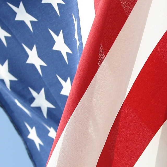
| Composition is a strong point, the opposing diagonals work very well. The colors, especially the blue, could be a bit more saturated. |
|
 Photographer found comment helpful. Photographer found comment helpful. |
|
|
10/12/2004 07:34:27 PM |
| I like this one a lot! I wish the stars were in better focus, rather than the stripes. Can't win 'em all though huh? Good job! |
|
| Photographer found comment helpful. |
|
|
10/12/2004 12:52:00 PM |
| I love this photo and at first wasn't sure how it fit into parts ... then my son said each thread is a part, each star is a part and then it dawned on me that this symbol is a part of us. Good job |
|
|
|
10/12/2004 07:12:17 AM |
|
|
|
10/10/2004 11:20:46 PM |
| Definitely meets the challenge - in my opinion. The color contrast in the blue is a little dull. Also, the edge of the blue is blurry which is distracting. Isn't the flag backwards (Blue on the right...). |
|
| Photographer found comment helpful. |
|
|
10/09/2004 11:21:16 AM |
| Very nice composition. Could use a bit more saturation in the colors, but over all a nice take on the Challenge. |
|
| Photographer found comment helpful. |
|
|
10/06/2004 08:54:38 PM |
| Good composition, color and balance. Good work and good luck! |
|
| Photographer found comment helpful. |
|
|
10/06/2004 04:47:46 PM |
| Beautiful - I really like it. More saturation or maybe contrast (whatever makes the colors deeper) could have made it better I think. |
|
| Photographer found comment helpful. |
Home -
Challenges -
Community -
League -
Photos -
Cameras -
Lenses -
Learn -
Help -
Terms of Use -
Privacy -
Top ^
DPChallenge, and website content and design, Copyright © 2001-2025 Challenging Technologies, LLC.
All digital photo copyrights belong to the photographers and may not be used without permission.
Current Server Time: 03/12/2025 10:29:12 PM EDT.