| Author | Thread |
Comments Made During the Challenge  |
|
|
10/12/2004 09:17:54 PM |
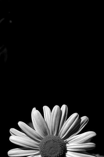
| Superb use of negative space. Your B&W techique is right on - great whites, blacks, and tonal range. |
|
|
|
10/12/2004 03:26:25 PM |
| Great composition and cropping here. Too bad there's no spot editing allowed, becase the mark in the top left corner is completely distracting for me. Otherwise I would consider this a top 20 photo. |
|
|
|
10/10/2004 10:57:55 PM |
| The grey elements at the top left distract from the picture, but other than that a very well composed b&w. I especially like that the negative space at the top 2/3rds focuses the eye on the flower. |
|
|
|
10/10/2004 10:05:26 PM |
| smudges in the upper left hand corner are distracting |
|
|
|
10/10/2004 09:52:50 PM |
| I like the creative composition. |
|
|
|
10/10/2004 09:05:03 PM |
|
|
|
10/10/2004 03:40:04 AM |
What is that on the top left?
Hmmm... take care of your background.... |
|
|
|
10/09/2004 04:50:53 PM |
|
|
|
10/09/2004 03:54:58 PM |
| you should have cropped it directly in the middle of the flower |
|
|
|
10/09/2004 01:53:42 PM |
| Love the use of negative space and like the b&w tones. Nice composition and lighting. |
|
|
|
10/08/2004 07:22:00 AM |
| beautiful! Great composition and lighting. Great use of B&W. A 9. |
|
|
|
10/07/2004 09:33:12 PM |
returning for comments
Very cute concept. In this case tha b/w (which looks good) dies not lend the petal the delicate rendition of the perals. I am certain you probably wrestled with color versud b/w. Despite my comment, you nevertheless have an attractive entranr here. |
|
|
|
10/07/2004 03:27:37 AM |
|
|
|
10/06/2004 10:11:23 PM |
Nice image but the white in the upper left hand corner is distracting.
dc |
|
|
|
10/06/2004 09:44:19 PM |
| Overall a very nice picture. But I think a solid black bacground might have worked better. The bit that is there is a distraction, and just seems odd to me. |
|
|
|
10/06/2004 09:42:40 PM |
| Nice picture. I would have rated it higher if you have had the black background all black. |
|
|
|
10/06/2004 04:15:46 PM |
| Very nice, but I probably would have liked it better in color. |
|
|
|
10/06/2004 03:04:45 PM |
| Looks a little like sunrise or sunset, doesn't it. I might have cropped a bit from the top to get rid of that artifact in the upper left, but that is 'nit picking' as it is a very nice image. |
|
|
|
10/06/2004 01:28:21 PM |
| Just one nit - that the black bg is not completely black. |
|
|
|
10/06/2004 12:05:14 PM |
| I would have liked it better if in color... |
|
|
|
10/06/2004 10:18:28 AM |
| There seems to be a couple of light spots in the top left that are distracting. Nice focus on the flower. |
|
Home -
Challenges -
Community -
League -
Photos -
Cameras -
Lenses -
Learn -
Help -
Terms of Use -
Privacy -
Top ^
DPChallenge, and website content and design, Copyright © 2001-2025 Challenging Technologies, LLC.
All digital photo copyrights belong to the photographers and may not be used without permission.
Current Server Time: 03/12/2025 02:26:51 PM EDT.