| Author | Thread |
|
|
02/24/2003 08:13:08 PM |
This is not my picture and I really don't know why this one appears...
Mine is showing a wet street surface with a bus in the back! |
|
|
|
01/30/2003 10:06:03 PM |
Critique Club critique:
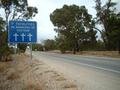
Composition/Content: The angle is very creative and adds interest to the image. It's easy to see what you wanted the image to convey, but it is hard to read the sign. I don't know whether or not I would know what it said if it weren't for the title of the image. My eye sees the beginning letters of the sign, and naturally travel along the letters as I read the word, and travel beyond to the bus. The center of attention seems to be right where you might step if you stepped off of the curb on the right. This is a great composition with many elements put together to create the whole.
Lighting: The lighting is dramatic with the wet pavement and reflections. The reflections are what help and hinder the image, making the sign difficult to read. I wonder if you would be able to read the sign if you took the exact image with a slave flash above the sign pointing down to illuminate the painted letters from above, leaving the rest of the image exactly the same.
Background: Background is good with the headlights pointed at the camera.
Camera Work/Technical: Good exposure. I wonder if you raised the camera a little higher off of the street surface and still kept the bus in the same position, whether or not the sign would be legible.
My Opinion: Very creative angle and composition. There is more to the image than appears at first.
|
|
 Photographer found comment helpful. Photographer found comment helpful. |
Comments Made During the Challenge  |
|
|
01/26/2003 11:23:35 PM |
| This photo loaded, and then I left my desk to check on something, and when I came back, I saw this photo from a distance. It looks better from a distance in that the words are readable then. Up close, it's all blurry due to the texture and reflection of light off the pavement. Perhaps a different angle, or a more wide-angle view would help. |
|
| Photographer found comment helpful. |
|
|
01/23/2003 09:18:09 PM |
| The tilt to the photo ruins it. Sorry. This is just my opinion. |
|
| Photographer found comment helpful. |
|
|
01/23/2003 07:12:02 PM |
| This is certainly a little different to most of this signs this week, and that in itself is refreshing. Choosing to have the picture rotated so much is also interesting (my boring nature wouldn't allow me to take such a shot!) Unfortunately the sign doesn't really draw my attention (except that it is the only focused point), but I certainly appreciate the attempt at something different. Well done. |
|
| Photographer found comment helpful. |
|
|
01/23/2003 08:45:10 AM |
| Nice angle. That bus is winking at you! |
|
| Photographer found comment helpful. |
|
|
01/22/2003 11:46:26 PM |
| You obviously got down and dirty for this shot. Nicely done, very nice colours. |
|
| Photographer found comment helpful. |
|
|
01/22/2003 01:01:31 PM |
| This is very well photographed. Superb! |
|
| Photographer found comment helpful. |
|
|
01/21/2003 07:17:41 PM |
| Wicked angle shot! The sign is a bit hard to read, but the bus coming (IMO) is a great touch, so that glare just had to be there. 7 Swash |
|
| Photographer found comment helpful. |
|
|
01/21/2003 06:25:44 PM |
maybe you should drag the prurple down a little bit? - very cool angle!
I like it... makes a 9 |
|
| Photographer found comment helpful. |
|
|
01/20/2003 09:25:12 PM |
| off topic..no sign. the angel is bothersome for me |
|
|
|
01/20/2003 09:04:19 PM |
| Interesting shot, but the lighting makes it a bit difficult to read the sign. |
|
| Photographer found comment helpful. |
|
|
01/20/2003 07:06:22 PM |
| Like this..neat idea, great find. |
|
| Photographer found comment helpful. |
|
|
01/20/2003 12:48:24 AM |
| Loved those signs in London - very helpful b/c I ALWAYS look left!! Great idea .. coulda been executed a bit better as I can't really read it like this. |
|
| Photographer found comment helpful. |
Home -
Challenges -
Community -
League -
Photos -
Cameras -
Lenses -
Learn -
Help -
Terms of Use -
Privacy -
Top ^
DPChallenge, and website content and design, Copyright © 2001-2025 Challenging Technologies, LLC.
All digital photo copyrights belong to the photographers and may not be used without permission.
Current Server Time: 03/12/2025 08:37:54 AM EDT.