| Author | Thread |
Comments Made During the Challenge  |
|
|
01/25/2003 05:31:11 PM |
| I KNOW I've seen that sign! (Fortunately, never up that close.) |
|
|
|
01/23/2003 12:06:45 PM |
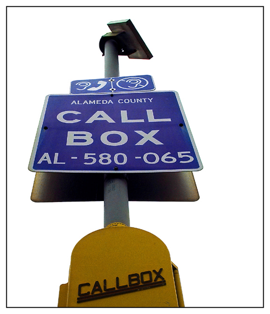
| The white backdrop is too bright. If it's the sky it definitely would've been better blue. - Inspzil |
|
|
|
01/22/2003 11:53:03 PM |
| How did you get the beautiful colors, good focus, and the completely white background unless you put a white posterboard behind it. But that doesn't appear to be the case. Well done. Like the boarder. Nice one for a 7. |
|
 Photographer found comment helpful. Photographer found comment helpful. |
|
|
01/22/2003 07:02:22 PM |
|
| Photographer found comment helpful. |
|
|
01/22/2003 12:05:21 PM |
|
|
|
01/21/2003 11:53:14 PM |
| Effectively removing the background really brings attention to the sign. To me it feels that cropping part of the callbox was a bad move - could you perhaps have taken the photo from lower down to include all of it? Other than that the focus is pretty good. The border is also nice and simple. |
|
| Photographer found comment helpful. |
|
|
01/21/2003 11:58:40 AM |
| Something misses here for me, which is frustrating, because it has most of the elements of a good photograph, to me. Maybe it's the letdown of the yellow on the callbox itself. I'll update if I can think of it. 6 |
|
| Photographer found comment helpful. |
|
|
01/20/2003 07:22:15 AM |
| What does that bit at the top right mean? "No ears?" :-) |
|
|
|
01/20/2003 12:33:01 AM |
| how did you get the white background. I do not like the border choice |
|
Home -
Challenges -
Community -
League -
Photos -
Cameras -
Lenses -
Learn -
Help -
Terms of Use -
Privacy -
Top ^
DPChallenge, and website content and design, Copyright © 2001-2025 Challenging Technologies, LLC.
All digital photo copyrights belong to the photographers and may not be used without permission.
Current Server Time: 03/12/2025 09:42:04 AM EDT.