| Author | Thread |
|
|
01/27/2003 07:23:36 PM |
Critique Club Comments by Grayce
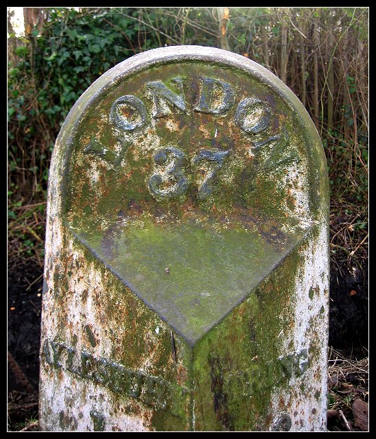
This has a wonderful aged appearance that just reeks with character. In this high tech society it is refreshing to see this.
I think this image would benefit from including more of the surroundings. It needs a sense of place. Perhaps a little off center and backed off would really bring this to life.
Regards,
Grayce |
|
Comments Made During the Challenge  |
|
|
01/26/2003 11:03:10 PM |
| you show the age of the marker very nicely, the greens and whites of time show up, but wonder if you should have shown the whole marker instead of just this part of it. The background falls in nicely also, the greens and browns fo the leaves and brances and the dead material around the right side of the marker. |
|
|
|
01/26/2003 01:41:58 PM |
| kinda wanna see where it hits the ground, like i'd want to see a person's feet. though maybe if you backed up that far you'd lose the focus on the letters. nice texture, looks ripe for macro shots. |
|
|
|
01/25/2003 10:26:29 AM |
| Nice texture and coloring. |
|
|
|
01/24/2003 01:54:31 PM |
| I like this :) Very tombstone-esque. Nice composition, centered works well here, and the DOF is enough to stop the background being too busy. |
|
|
|
01/24/2003 10:45:11 AM |
| the fact that it's hard to read negates the purpose of the close up |
|
|
|
01/24/2003 12:13:14 AM |
| is that a road sign or a tombstone. Either way I like the old rustic look |
|
|
|
01/23/2003 01:39:00 PM |
| Very cool sign sign. Nice clarity. |
|
|
|
01/23/2003 12:10:46 PM |
| Strange rustic sign. What is this made out of? is it copper or just painted? Good find. I like the brightness at the top of the pic. Looks like you almost got a sun flare. Good pic - Inspzil |
|
|
|
01/22/2003 02:42:06 AM |
| Very nice find, there probably arent any signs that old anywhere in the area I live. |
|
|
|
01/21/2003 11:10:27 PM |
| I have a passion for "olde" Europe and this one fits right in! |
|
|
|
01/21/2003 02:37:07 PM |
|
|
|
01/20/2003 11:06:22 PM |
|
|
|
01/20/2003 09:23:14 PM |
| Nice photo - it made sense to centre this photo like you have. I might have tried a more shallow depth of field to really blur the bushes in the background (if that option is available to you). Good work |
|
|
|
01/20/2003 05:39:09 PM |
| Is this a "road sign"? I obviously don't understand it. But I might figure it out if the photo had been taken further back and I could see some of the street and surroundings. It's cropped too tightly on the sign for those of us who don't live over there. It is a good sharply focused photo other wise. Just too cramped. Best I can do is give it a 5. |
|
|
|
01/20/2003 10:41:24 AM |
| Straighten it please - tilted pictures are my pet peeve - even if the marker was tilted. |
|
|
|
01/20/2003 10:31:41 AM |
| you would have to driving as fast as a horse buggy to be able to read this sign |
|
|
|
01/20/2003 02:31:22 AM |
| Good shot. DOF could have been a little better.. Cub |
|
|
|
01/20/2003 01:18:20 AM |
| I wonder if this might have worked better with a different angle - say, closer to the ground looking up, or from the side. Nice find, though. |
|
Home -
Challenges -
Community -
League -
Photos -
Cameras -
Lenses -
Learn -
Help -
Terms of Use -
Privacy -
Top ^
DPChallenge, and website content and design, Copyright © 2001-2025 Challenging Technologies, LLC.
All digital photo copyrights belong to the photographers and may not be used without permission.
Current Server Time: 04/27/2025 12:34:33 AM EDT.