| Author | Thread |
|
|
02/20/2005 09:11:14 AM |
| Actually, looking at this again, I think it's quite nice! |
|
 Photographer found comment helpful. Photographer found comment helpful. |
|
|
02/08/2005 08:51:27 AM |
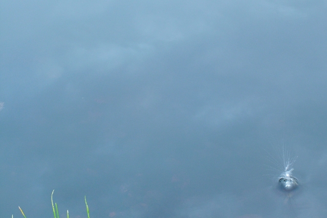
great idea, bud. i think it would be worth revisiting, with the splash close to where it is, but not so pinned into the corner, and with just a bit more grass--not a lot, but just a bit more.
Message edited by author 2005-02-08 09:01:11. |
|
| Photographer found comment helpful. |
Comments Made During the Challenge  |
|
|
11/07/2004 08:01:05 PM |
| The grass in the lower left is distracting to me. The concept is great though... I think it would be more successful if simplified to the splash and the water around it. |
|
| Photographer found comment helpful. |
|
|
11/07/2004 03:09:19 PM |
|
|
|
11/06/2004 04:05:17 PM |
| interesting, i think a little bit tighter of a crop to help show the detail in the splash would be nice but not too much because the comp is great but the grass im not sure about.. |
|
| Photographer found comment helpful. |
|
|
11/06/2004 12:07:03 PM |
| would have been much stronger without the grass. |
|
| Photographer found comment helpful. |
|
|
11/05/2004 02:10:01 PM |
| Interesting and creative take here; for me, it just isn't working - too much negative space and not enough to engage my interest. |
|
| Photographer found comment helpful. |
|
|
11/04/2004 10:12:51 PM |
|
|
|
11/04/2004 08:08:10 PM |
| Too much dead space, the splash should have been MUCH larger if this is going to be your title. The green blades of grass are distracting. |
|
| Photographer found comment helpful. |
|
|
11/04/2004 11:12:59 AM |
| I really like the negative space in this photo - but I would have rather that there was no grass at all, and maybe a bigger or better splash. |
|
| Photographer found comment helpful. |
|
|
11/03/2004 11:38:17 PM |
| I'm sorry, but this isn't one of my favorites in the challenge. I'm not sure why you chose to keep the grass spriggs in the shot, and it's taking an awful lot of eye strain to see what that splash subject actually is. |
|
| Photographer found comment helpful. |
|
|
11/03/2004 01:36:19 PM |
| the grass on the left ruins this shot. You really should have cloned it out. |
|
| Photographer found comment helpful. |
|
|
11/02/2004 03:45:57 PM |
Without the grass and with some more sharpness this would realy stand out.
Now it's a realy nice pic, but the grass is realy distracting. |
|
| Photographer found comment helpful. |
|
|
11/02/2004 03:43:01 PM |
| Intersting shot. If it was a little sharper and more of the grass in the foreground would be better imho. |
|
| Photographer found comment helpful. |
|
|
11/02/2004 11:48:26 AM |
| Good stop in motion. But its a bit out of focus. 5 |
|
| Photographer found comment helpful. |
|
|
11/02/2004 03:21:27 AM |
| Im not understanding this pic. I hope after the challenge you can tell me what it is. |
|
| Photographer found comment helpful. |
|
|
11/02/2004 01:43:39 AM |
| 4. The image and composition you were shooting for just doesn't work for me. The blades of grass on the lower left simply distract me from the focus which I believe to be the splash according to the title. Also, putting the splash closer to the rule of 3rds might have helped ease the issue of negative space a bit. |
|
| Photographer found comment helpful. |
|
|
11/01/2004 01:02:57 PM |
| The grass or whatever the green is in the lower left is very distracting from a picture like this. |
|
| Photographer found comment helpful. |
Home -
Challenges -
Community -
League -
Photos -
Cameras -
Lenses -
Learn -
Help -
Terms of Use -
Privacy -
Top ^
DPChallenge, and website content and design, Copyright © 2001-2025 Challenging Technologies, LLC.
All digital photo copyrights belong to the photographers and may not be used without permission.
Current Server Time: 04/07/2025 01:01:44 PM EDT.