| Author | Thread |
Comments Made During the Challenge  |
|
|
10/17/2004 10:23:18 PM |
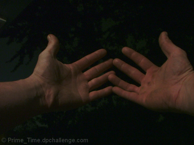
| Quite dark here, and perhaps these hands could use a few other symbols to help us out: tools, workbench, etc. Isolating them, we rely on your title to tell us they are carpenter's hands. I like the framing and cropping here, and the pose of the hands is also effective. |
|
 Photographer found comment helpful. Photographer found comment helpful. |
|
|
10/17/2004 08:38:03 PM |
Returning for comments.
A very good concept. I would have opted for a little more light and contrast, otherwise a very nice image. |
|
| Photographer found comment helpful. |
|
|
10/17/2004 06:56:06 PM |
| Would have been more effective if you'd had tools or wood chips etc. in the background. This just looks like dirty hands of maybe a lumberjack |
|
| Photographer found comment helpful. |
|
|
10/16/2004 09:03:50 PM |
| Although a good idea, this interpretation isn't very compelling. It's too dark, so the interesting details of the hands' surfaces are obscured. Including some context in the background would have also added interest (for example, his woodshop with tools or works in progress showing, or a newly framed house). |
|
| Photographer found comment helpful. |
|
|
10/15/2004 10:43:19 AM |
| Perhaps a bit dark and out of focus... I'd like to see the hands a little better to understand just what is so interesting about this person's hands. |
|
| Photographer found comment helpful. |
|
|
10/13/2004 01:35:19 PM |
|
| Photographer found comment helpful. |
|
|
10/13/2004 10:38:18 AM |
| A bit too dark, not enough detail on the rough skin or dirt. |
|
| Photographer found comment helpful. |
|
|
10/12/2004 11:39:32 PM |
| A little dark for my tastes, but a nice shot. |
|
| Photographer found comment helpful. |
|
|
10/12/2004 07:57:09 AM |
| Nice idea, but it seems blurry and too dark. |
|
| Photographer found comment helpful. |
|
|
10/11/2004 08:21:10 PM |
| Carpenter needs to get more lights if he doesn't want to smash his thumbs. This image is quite dark and thus has low contrast. Can't tell if we're looking down at water or up at some tree branches and sky. |
|
| Photographer found comment helpful. |
|
|
10/11/2004 08:16:57 PM |
| Much too dark--cannot see the callouses and roughness that define a person who works with his hands. |
|
| Photographer found comment helpful. |
|
|
10/11/2004 10:38:01 AM |
| Great idea! But the darkness really doesn't work for me... |
|
| Photographer found comment helpful. |
|
|
10/11/2004 07:45:26 AM |
| Lacks contrast, a bit dull. |
|
| Photographer found comment helpful. |
|
|
10/11/2004 06:15:32 AM |
| great idea, just a bit too dark for me... |
|
| Photographer found comment helpful. |
|
|
10/11/2004 02:33:51 AM |
| A little dark and grainy. More light or maybe even a little levels adjustment in Photoshop could fix it a bit. |
|
| Photographer found comment helpful. |
|
|
10/11/2004 12:28:40 AM |
| this is a great idea and i think my favorite yet, but better light and better composition wold have been great...and the background?...is that trees? |
|
| Photographer found comment helpful. |
Home -
Challenges -
Community -
League -
Photos -
Cameras -
Lenses -
Learn -
Help -
Terms of Use -
Privacy -
Top ^
DPChallenge, and website content and design, Copyright © 2001-2025 Challenging Technologies, LLC.
All digital photo copyrights belong to the photographers and may not be used without permission.
Current Server Time: 03/12/2025 03:13:30 PM EDT.