| Author | Thread |
|
|
01/27/2003 05:45:15 AM |
Critique Club by Inspzil
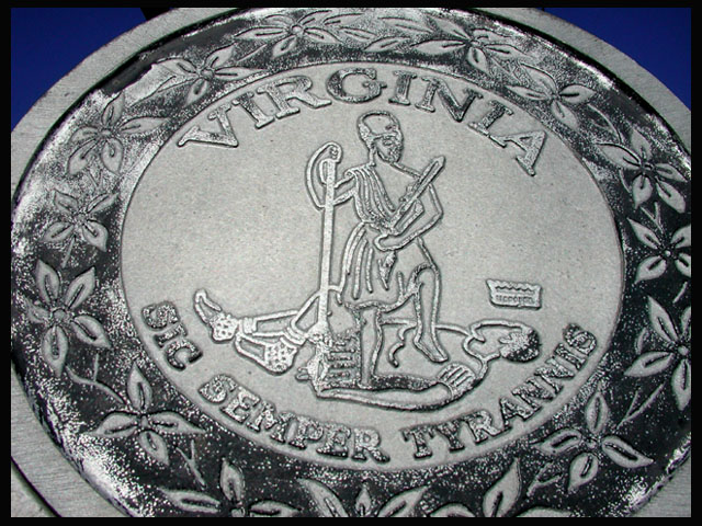
Composition - I don't remember seeing this pic so I can't tell you what I originally scored it. The subject of this picture is pretty interesting. This is what I think some of the shortcomings are. First - The crop is awful tight. Seeing the whole circle would be better. It also seems to be cropped from the left side a little less than the right side. A picture framed like this one is should be perfectly centered. Second - I'm not sure what makes part of the writing and drawing white but I don't like it. From wear on the sign or flash, either way I don't think it helps the image. I would've shown more of the sky here. The sky that we can see in the corners is a beautiful deep blue. Maybe there was something behind it, in which case you did the right thing.
Photography - The picture is very clear. The angle is good. I like a looking up perspective shot as much as anyone. If you used the flash for this one, it would explain the white areas in the words and on the figures. If not, then disregard that last part.
Processing - Nothing real obvious is showing, so I'll say nothing
Overall - The subject is pretty good. It doesn't have any real outstanding features to it. I don't really care for the crop, but there might be some extenuating circumstances which warrant this decision. If I did vote for this photo, I can't say I'd give it a great score. It is a well taken photo, but taking a photo well can only carry you so far with a mediocre subject. Looking at your other comments, I'm not telling you anything they didn't (I never look at them until I'm done). Good luck in future challenge and keep shooting BAMartin. - Inspzil |
|
 Photographer found comment helpful. Photographer found comment helpful. |
Comments Made During the Challenge  |
|
|
01/26/2003 01:55:16 PM |
| i would like to see a bit more background so i could get a handle on the area |
|
| Photographer found comment helpful. |
|
|
01/26/2003 12:05:42 PM |
| you should have cropped out the sky...it is distracting |
|
| Photographer found comment helpful. |
|
|
01/23/2003 07:06:56 PM |
| too close for comfort. should show the whole marker with some background perhaps? |
|
| Photographer found comment helpful. |
|
|
01/23/2003 12:00:28 AM |
| Where was this photo taken? It looks more like a coin than a historical marker - is it preserved in a museum or something? Unfortunately, being taken so close it loses its context as a road sign. Your focus is quite good, although I'm not sure why you have cropped it unevenly (perhaps to hide objects beside it?). |
|
| Photographer found comment helpful. |
|
|
01/21/2003 11:36:13 PM |
| Great capture, cropping! If I was nit picking, I would try to eliminate the black area at the upper left right above the sign. |
|
| Photographer found comment helpful. |
|
|
01/21/2003 04:25:20 PM |
| Nice angle, very clear shot. The wear on the sign did make me wonder a bit about the photo quality, but it's the sign....IMO, too close. I want to see at least the whole pattern, if not the whole sign (looks like a wonderful blue background behind the sign, was there something we're not seeing that was really bad?) I can't decide if that's glare on the sign (esp. the staff and foot bindings) or if that's wear on the sign. (let's call it wear, O.K?) 7 Swash |
|
| Photographer found comment helpful. |
|
|
01/20/2003 11:20:09 PM |
|
|
|
01/20/2003 07:35:41 PM |
|
|
|
01/20/2003 11:12:54 AM |
| almost looks like a coin. |
|
Home -
Challenges -
Community -
League -
Photos -
Cameras -
Lenses -
Learn -
Help -
Terms of Use -
Privacy -
Top ^
DPChallenge, and website content and design, Copyright © 2001-2025 Challenging Technologies, LLC.
All digital photo copyrights belong to the photographers and may not be used without permission.
Current Server Time: 04/28/2025 08:00:30 AM EDT.