| Author | Thread |
|
|
01/29/2003 03:29:59 AM |
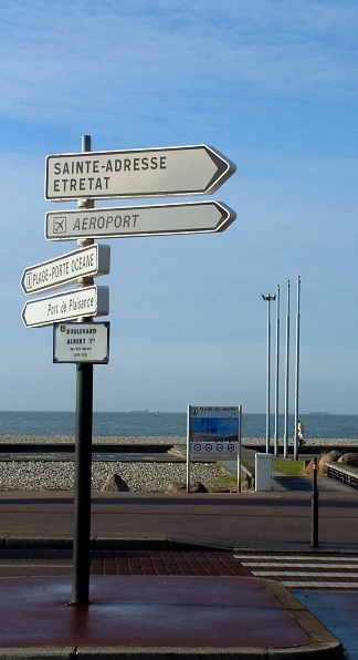
| "Ã la plage" is French for "At the Beach" |
|
|
|
01/28/2003 07:22:32 PM |
CC:
paynekj<-hello!
---------------------------
Fits The Challenge-Sure does.
Composition-Busy
Background-Beautiful blue sky/beach/ocean.
Digital Processing-I'd of like to see the bottom cropped off shorter. That or just reversed and the bottom lightened up with levels and less sky.
My Opinion-Being dark and busy are the weak areas. Means little to me that my high school French wasn't my best subject. I don't need to know the meaning, I'm smart enough to see one is to the airport and at least one other is to the port. Overall a pleasing shot, just two small areas that could of been changed.
Thanks for the chance to review your photo in Critique Club.
Message edited by author 2003-01-28 19:23:29. |
|
 Photographer found comment helpful. Photographer found comment helpful. |
Comments Made During the Challenge  |
|
|
01/26/2003 11:34:48 PM |
|
|
|
01/26/2003 02:25:21 PM |
| less sky would make a more dynamic image, nice job |
|
| Photographer found comment helpful. |
|
|
01/23/2003 07:28:35 PM |
| Looks confusing, busy, a lot to look at, all at once. |
|
| Photographer found comment helpful. |
|
|
01/23/2003 06:01:13 PM |
| Very good, clear shot. Nice color. Interest level seems a little low, please draw me, the viewer, into your shot (but no suggestions, sorry!) 7 Swash |
|
| Photographer found comment helpful. |
|
|
01/22/2003 02:41:54 PM |
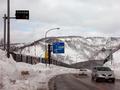
| there is too much darkness in the foreground. maybe a tighter crop that didn't include the street would look better. |
|
| Photographer found comment helpful. |
|
|
01/22/2003 11:27:07 AM |
| Nicely composed, although your signs and horizon seem a bit tilted. |
|
| Photographer found comment helpful. |
|
|
01/21/2003 11:38:48 PM |
| Nice composition, looks like it needed a slight rotation to the left to get the ocean line level. |
|
| Photographer found comment helpful. |
|
|
01/21/2003 04:29:56 AM |
Ah France, lovely country. And this is a great shot. Good composition.
|
|
|
|
01/20/2003 05:55:13 PM |
| I don't understand what the signs say, nor do I understand your title. But I like the photo. It's well done. Nicely cropped, good focus, nice composition. I just wish I could understand at least your title so I could do a really fair score as to meeting the challenge. But I'll give it a 5. |
|
| Photographer found comment helpful. |
Home -
Challenges -
Community -
League -
Photos -
Cameras -
Lenses -
Learn -
Help -
Terms of Use -
Privacy -
Top ^
DPChallenge, and website content and design, Copyright © 2001-2025 Challenging Technologies, LLC.
All digital photo copyrights belong to the photographers and may not be used without permission.
Current Server Time: 03/12/2025 02:53:48 PM EDT.