| Author | Thread |
|
|
10/20/2004 08:02:37 AM |
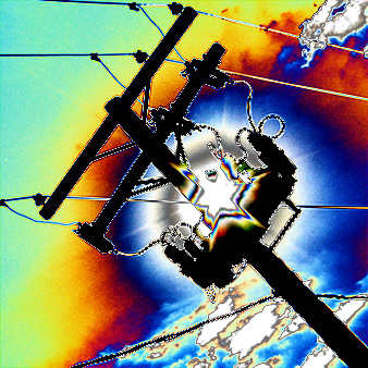
| Thanks to everyone for your comments pro and con. For those who asked, I achieved this effect by using extreme curves adjustments. |
|
Comments Made During the Challenge  |
|
|
10/19/2004 11:53:29 PM |
| Meets the challenge, but YEOW is that overprocessed! It looks more like a painting than a photo IMO. Sorry! 4 |
|
|
|
10/19/2004 10:31:04 PM |
| Very digital art, and your score will probably suffer for it, but I really like it and would love to hear how you did it. Nice job. |
|
|
|
10/19/2004 10:58:41 AM |
| way oversaturated. Makes a nice graphic, but doesn't work as a photograph. |
|
 Photographer found comment helpful. Photographer found comment helpful. |
|
|
10/19/2004 10:35:13 AM |
| This is great, pity it is so small. |
|
| Photographer found comment helpful. |
|
|
10/19/2004 07:55:44 AM |
| Colorful shot with a good angle that gives it little off-beat feeling. |
|
| Photographer found comment helpful. |
|
|
10/17/2004 03:32:12 PM |
| One of the good photo. I think u used very much computer effect in this.. may be. |
|
|
|
10/17/2004 12:30:53 PM |
| woooo awesome.....it's validated!!! awaiting to knoe how's it done!! |
|
|
|
10/16/2004 11:31:42 PM |
I never have and never will appreciate these psychedelic, way overprocessed shots...
TC |
|
|
|
10/16/2004 11:18:14 AM |
I don't like doing this, but I guess its personal opinion! I just didn't like the picture. I get the communication idea and I think it would have been a good picture if it was toned down a bit and you could have called it something like 'communication breakthrough', with what it seems like the sun breaking through the clouds�! �Don�t kill the �� ;-)
Hopefully I was the only one with this bad opinion, nice picture for a album cover!
|
|
| Photographer found comment helpful. |
|
|
10/15/2004 06:20:28 PM |
| Looks like you used curves? |
|
|
|
10/15/2004 02:30:55 AM |
| overprocessed... this is really digital art not photography |
|
| Photographer found comment helpful. |
|
|
10/14/2004 03:58:58 PM |
| Definitely different, and meets the challenge on the most basic of levels. The hue shifting, however, is just not to my taste. Pretty dynamic piece of graphic art in my opinion, but not something I generally score high. |
|
| Photographer found comment helpful. |
|
|
10/14/2004 12:42:54 PM |
| Like this image! Radical for basic editing! Congrats my friend! |
|
| Photographer found comment helpful. |
|
|
10/14/2004 11:34:56 AM |
| No idea how you did it :). Great sense of humor. So even a telephon pole can look surrealistic a bit? 8 for me. |
|
| Photographer found comment helpful. |
|
|
10/13/2004 03:10:30 PM |
| I can't say I'm fond of the effects here at all... |
|
|
|
10/13/2004 09:27:35 AM |
| This may be legal, but seems more of a digital art than a photograph. Composition is nice, but way overprocessed. |
|
| Photographer found comment helpful. |
|
|
10/13/2004 08:53:48 AM |
| Sorry but not at all a fan of these edited shots with funky effects, that´s why I rated it very low. Just please keep in mind that this is only my opinion and if you like it that´s all that matters. |
|
| Photographer found comment helpful. |
|
|
10/13/2004 02:14:21 AM |
| i feel as though you has strayed too far from the photograph.... too much manipulation. take it down a couple of notches next time |
|
| Photographer found comment helpful. |
Home -
Challenges -
Community -
League -
Photos -
Cameras -
Lenses -
Learn -
Help -
Terms of Use -
Privacy -
Top ^
DPChallenge, and website content and design, Copyright © 2001-2025 Challenging Technologies, LLC.
All digital photo copyrights belong to the photographers and may not be used without permission.
Current Server Time: 03/12/2025 09:12:49 PM EDT.