| Author | Thread |
|
|
01/31/2003 12:03:53 AM |
Greetings from the Critique Club...
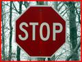
COMPOSITION... Can't really say anything bad about the composition, but at the same time there's not much going on either. I think mainly because I'd expect for the sign to say something about the environment its in... The sign seems to be just there. What's the motivation for choosing a "no trucks allowed" sign as opposed to other signs? I guess other than that, the image has the feel of a snapshot, taken from the vantage point of someone simply looking at the sign. If you explore different ways of composing your images, try to find unique angles and view points. Try getting very low, high, diagonal, putting in leading eye objects, etc. Background's not cluttered, the elements of your photo are simple and clear. I actually like the many different colors in the background, gives the photo something else interesting to look at, but I would have liked them more if they weren't blurry...see next part
TECHNIQUE... I like the fact the sign appears unusually bright, done with flash I would suspect. Really makes the subject standout. As for the buildings, they really should be sharper, and perhaps should have been exposed a bit longer, I don't know if that would have made them slightly more visible.
OVERALL... A tripod would have certainly helped here. If no tripod's around try finding some sort of support - a mailbox, fence, anything to steady your camera when taking nightshots that require a long exposure. You may have not needed a long exposure to capture the sign with your flash but I think the background could have benefitted by a steady, long exposure. |
|
 Photographer found comment helpful. Photographer found comment helpful. |
Comments Made During the Challenge  |
|
|
01/26/2003 11:33:05 PM |
| what is that brown thing in the sign...it can't mean what I think it is no turds |
|
|
|
01/26/2003 09:23:16 PM |
| The buildings in the background are a little blurry and decrease from the effectiveneess of this picture. jgillard |
|
|
|
01/26/2003 02:21:38 PM |
| It would have been nice if the background did not show evidence of camera shake, and was in better focus. |
|
| Photographer found comment helpful. |
|
|
01/23/2003 12:13:20 PM |
| Too much foreground? Nice focus hghilighting the subject. |
|
|
|
01/22/2003 11:45:16 PM |
| An interesting shot :) It seems a bit over exposed on the sign, and fuzzy in the background. I realize this is probably your intentions though :) It's very eye catching :) Keep up the good work! -Annida |
|
|
|
01/22/2003 10:57:55 PM |
| Sorry but I can only give this a 1. There is no focus except on the sign. Thre really is no composition to the photo. |
|
|
|
01/22/2003 02:11:15 PM |
| i don't know what is going in the background whether it was some overdone legal adjustments or motion or whatever. sign is good, everything else isn't |
|
|
|
01/22/2003 09:07:25 AM |
| Interesting exposure; long with a flash? |
|
|
|
01/21/2003 10:49:48 PM |
| This sign looks like it's on the tenth floor to me. |
|
|
|
01/21/2003 04:11:18 PM |
Neat colors. A tripod really helps the shake. (Did you want the shake?) It's nearly impossible to hold the camera THAT still for more than a second or so. On my monitor the red "no" sign goes from pale red to strong red (left to right), could be parly due to the camera shake. How in the world did you get the "no" sign to be looking this solid, while the rest of the frame is shaking like an earthquake?
5 Swash |
|
|
|
01/21/2003 11:26:22 AM |
|
|
|
01/21/2003 05:05:32 AM |
|
|
|
01/20/2003 07:07:48 PM |
| God, this is the worst... NO TITLE!!?? The whole point of this is a funny sign with a TITLE to make it funny! LOL. |
|
|
|
01/20/2003 09:50:06 AM |
| not sure if i like the effect of the stable subject but blurred background - but it was well executed |
|
|
|
01/20/2003 02:57:12 AM |
| Too harsh for me, but then I'm an old fogey :-( Cub |
|
|
|
01/20/2003 12:42:57 AM |
| someone is in need of a tripod :P |
|
Home -
Challenges -
Community -
League -
Photos -
Cameras -
Lenses -
Learn -
Help -
Terms of Use -
Privacy -
Top ^
DPChallenge, and website content and design, Copyright © 2001-2025 Challenging Technologies, LLC.
All digital photo copyrights belong to the photographers and may not be used without permission.
Current Server Time: 03/12/2025 11:16:43 PM EDT.