| Author | Thread |
Comments Made During the Challenge  |
|
|
01/26/2003 09:45:50 PM |
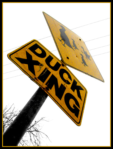
| I like the idea of taking the photo at an agle. Just personally don't like this angle. Makes the tope of the ducks sign fade out. Also placement is akward in fame - hard to center it diagonally. |
|
|
|
01/26/2003 02:00:55 PM |
|
 Photographer found comment helpful. Photographer found comment helpful. |
|
|
01/25/2003 08:27:22 PM |
| Nice perspective shot. Too bad the signs are so grainy. Maybe they are just dirty, I can't tell. Good photo anyway. |
|
| Photographer found comment helpful. |
|
|
01/24/2003 09:38:58 PM |
| I like how you filled the entire frame. I'm not crazy about the angle, find it a bit disorienting. Good luck. Jacko. 7 |
|
| Photographer found comment helpful. |
|
|
01/24/2003 07:32:51 PM |
| The perspective is very good..I like your angle shot..only suggestion would be that the glare on the top sign is distracting. |
|
| Photographer found comment helpful. |
|
|
01/24/2003 01:48:39 PM |
| Nice angle, good photo, but the sky seems a little over-exposed and bleeds into the top of the sign. 9 |
|
| Photographer found comment helpful. |
|
|
01/24/2003 12:57:26 AM |
| nice angle..I normally hate borders but this one works well |
|
| Photographer found comment helpful. |
|
|
01/23/2003 07:23:20 PM |
| hmmm. never thought of looking at anything from their point of view before. |
|
| Photographer found comment helpful. |
|
|
01/23/2003 08:21:48 AM |
| Interesting shot. I like the angle. |
|
| Photographer found comment helpful. |
|
|
01/22/2003 11:05:06 PM |
| Sky is totally devoid of color. |
|
|
|
01/22/2003 10:37:36 PM |
nice perspective. the lighting on the top of the sign is too harsh. powelines aren't good either. good composition though
|
|
| Photographer found comment helpful. |
|
|
01/22/2003 05:37:02 PM |
| Good angle. Original idea. |
|
| Photographer found comment helpful. |
|
|
01/21/2003 06:16:14 PM |
| I like the concept - as explained by the title. I find the whitish sky a little too intense, especially at the top point of the sign. Also the yellow portion of the border looks great as the signs base but is washed out at the top of the image. Overall though, not a bad photo at all - certainly has some interest to it. |
|
| Photographer found comment helpful. |
|
|
01/20/2003 05:16:43 PM |
| I'm guessing here that the ISO was a little high for this, hence the coarse grain and the brightness on the top right hand side? Great idea though! |
|
| Photographer found comment helpful. |
|
|
01/20/2003 03:38:04 PM |
Great idea for the shot! I bit overexposed on the top though... Was there anybody watching when you crouched down on the side of the road to get this? ;)
|
|
| Photographer found comment helpful. |
|
|
01/20/2003 02:30:41 PM |
| a little overexposed, but i like the perspective. quack! |
|
| Photographer found comment helpful. |
|
|
01/20/2003 11:02:20 AM |
| Aww, too bad about the powerlines. Times like this makes you want to allow post processing touchups, huh? |
|
| Photographer found comment helpful. |
|
|
01/20/2003 01:11:57 AM |
| is it oversaturated or is the yellow paint damaged? nice angle and crop |
|
| Photographer found comment helpful. |
|
|
01/20/2003 01:09:05 AM |
| Nice concept, and photograph. I wish the top of the sign hadn't been quite as bright, but this is still a very good shot. |
|
| Photographer found comment helpful. |
Home -
Challenges -
Community -
League -
Photos -
Cameras -
Lenses -
Learn -
Help -
Terms of Use -
Privacy -
Top ^
DPChallenge, and website content and design, Copyright © 2001-2025 Challenging Technologies, LLC.
All digital photo copyrights belong to the photographers and may not be used without permission.
Current Server Time: 03/12/2025 08:09:56 AM EDT.