| Author | Thread |
|
|
08/26/2014 08:05:38 AM |
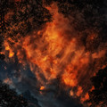
Critique Club Review:
Color Saturation and Hue: Colors look natural
Brightness and contrast: the image is very dark, maybe you monitor needs to be calibrated and it too bright, there are no black detail in the keys
Focus and depth of field: the image is clear and sharp
overall its a nice image and message, better lighting would have gone a long way here and maybe even a slightly lower perspective to see more reflection |
|
 Photographer found comment helpful. Photographer found comment helpful. |
Comments Made During the Challenge  |
|
|
07/31/2014 10:54:36 PM |
|
| Photographer found comment helpful. |
|
|
07/31/2014 09:27:45 AM |
| Good still life, but considerably underexposed |
|
| Photographer found comment helpful. |
|
|
07/30/2014 11:20:36 AM |
| Good idea but it looks a bit underexposed to me. |
|
| Photographer found comment helpful. |
|
|
07/29/2014 07:05:31 PM |
|
| Photographer found comment helpful. |
|
|
07/25/2014 06:53:45 PM |
| Love the concept, but it's a bit flat overall. A curves adjustment could have really made this pop. |
|
| Photographer found comment helpful. |
Home -
Challenges -
Community -
League -
Photos -
Cameras -
Lenses -
Learn -
Help -
Terms of Use -
Privacy -
Top ^
DPChallenge, and website content and design, Copyright © 2001-2025 Challenging Technologies, LLC.
All digital photo copyrights belong to the photographers and may not be used without permission.
Current Server Time: 03/14/2025 05:23:49 PM EDT.