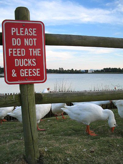
| A nice concept, but the photograph is lacking a touch technically, IMO. It's a little over-exposed, with a flat feel (not enough contrast). White balance seems to be off, as the geese/ducks are bluish tinged, and the sign seems to have a great deal of artifacting in the red. A couple of extra shots at a few more stops down, or with exposure compensation dialed down a bit, might have given you something more to work with, and a little more post-editing work would have also done wonders. Still, I like the concept, and the composition is nice. The fence is unfortunate, but out of your hands. Keep up the good work, and keep shooting. |