Great concept, although God is in the details for this sort of setup :)
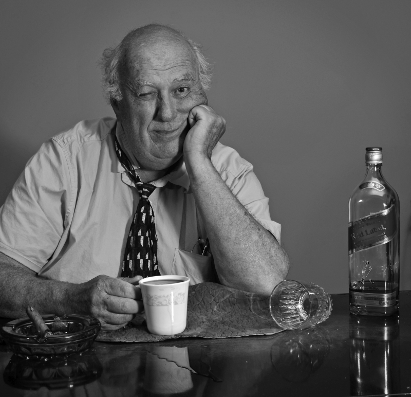
First, the tilt... I'm also not sure what the cloth thing is, or why it's there, but it's all scrunched up, which is distracting and makes no sense. Also, eliminating it would have also increased the area of the wonderful reflection.
Lightingwise, it is good, but I think this could have been great. A bit more distance from the background would not have lit it up so much. Also, I think I see two light sources - rather than have them evenly lit, I might have tried for the key on camera right to be at least 2/3 stronger than the fill on the left. The lighting could also have been improved in post, adding a bit of a vignette, and some more brightness to the subject. There's an overall dullness to the lighting to my eye. |