| Author | Thread |
|
|
08/08/2014 02:20:09 PM |
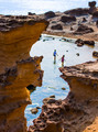
IMO, this is a victim of split primary subject - the rocks in the foreground, or the waterfalls? To see what I mean, look at the image with the top just above the top of the bottom water falls.

This is a great shot of one falls, its catch basin and glistening rocks. Then, look at the shot with the bottom just below the white spot on the rock just left of the bottom of the falls.

This is a very nice shot of a waterfalls in the woods. Either main subject is better than the shot as you entered it.
Of course, you scored better than me in this challenge, so what do I know?
Message edited by author 2014-08-08 14:27:48. |
|
 Photographer found comment helpful. Photographer found comment helpful. |
|
|
08/08/2014 12:17:05 PM |
| I think the processing killed a very nice image. It's too dark and not crisp (overall kinda oof) and for some reason I want to rotate it very slightly counterclockwise |
|
| Photographer found comment helpful. |
|
|
08/08/2014 10:19:51 AM |
| For me it looks muddy & the color black in the upper right dominates the image. IMO the best thing about a landscape is its abstract quality, & this one doesn't have much abstract-for me, the best thing about this is the rocks underwater. Next time you go out to get some nice landscapes, take a moment to get a few macro shots as well. But I am not a landscape photog. |
|
| Photographer found comment helpful. |
|
|
08/08/2014 09:49:31 AM |
I gave it a 5, which is really high for a waterfall shot. I like the wide angle distortion and the fogginess of the top contrasting with the sharpness of the bottom ... all stuff the other voters probably did not like.
What Cuttooth says is "too busy" I would say is a good, dynamic rhythm that keeps the eye moving. But DPC is LCD. Keep it simple. |
|
| Photographer found comment helpful. |
|
|
08/08/2014 08:29:02 AM |
It's a nice scene Joshua but I think the picture overall is too busy. My eye is in constant movement and can't really land on a focal point. I think the top portion could've been cropped out (the area of trees) and that may have given more focus on the foremost water fall area. The contrast seems a bit to strong on the image overall as well.
Looking at your other shot in landscape orientation, I definitely like that one better. It looks like you added a stronger vignette in that my attention goes directly to the waterfall.
Just one voters opinion so hope this helps. |
|
| Photographer found comment helpful. |
|
|
08/08/2014 08:28:01 AM |
| I gave you a rounded up six. I think it may not have done so well because the actual water fall take up such a small portion of the photo. Also, the light & contrast is uneven, very light and low contrast at the top, darker and nice contrast at the bottom. I much prefer the landscape version you posted. That, too probably would have gotten a six from me, but it would have been a rounded down six. |
|
| Photographer found comment helpful. |
Home -
Challenges -
Community -
League -
Photos -
Cameras -
Lenses -
Learn -
Help -
Terms of Use -
Privacy -
Top ^
DPChallenge, and website content and design, Copyright © 2001-2025 Challenging Technologies, LLC.
All digital photo copyrights belong to the photographers and may not be used without permission.
Current Server Time: 03/10/2025 07:44:27 PM EDT.