| Author | Thread |
|
|
02/02/2003 01:49:12 PM |
Greetings from the Critique Club :)
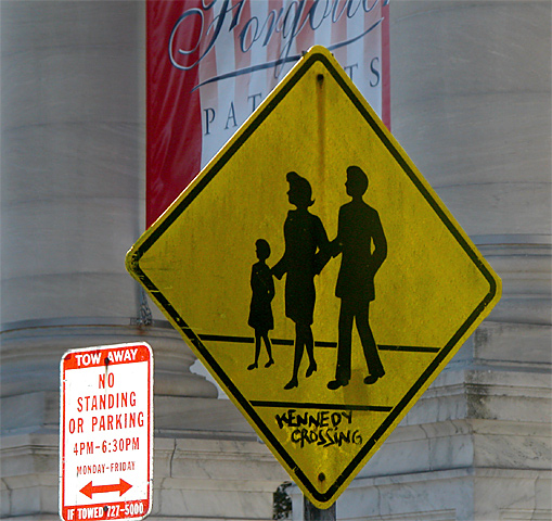
I particularly like the crosswalk sign in this image. It's off-center composition seems to work really well. I also consider that sign to be the 'subject' of this shot. That being the case, the 'no standing or parking' sign seems to be creating a minor problem for me. It is catching some light from somewhere that is making it much brighter than your 'subject' sign. I'm not sure if these two signs are supposed to be related in some way... I can't see it though.
Unfortunately, I believe that the banner behind the crossing sign is also somewhat distracting from the composition as well. I can't really offer any suggestions for improvement on this image. Not knowing the environment, I would not want to try to suggest different angles. There is probably a lot of clutter looking from other perspectives on this sign...
John Setzler
|
|
Comments Made During the Challenge  |
|
|
01/26/2003 09:44:17 PM |
| I guess only the kennedy's are allowed to stand around! jgillard7 |
|
|
|
01/26/2003 01:46:18 PM |
| perfect i love the yellow sign! |
|
|
|
01/26/2003 11:35:59 AM |
| should have cropped a bit more for my taste |
|
|
|
01/22/2003 11:29:06 PM |
| But where's Little John? :) |
|
|
|
01/22/2003 10:49:55 PM |
| haha, that's hilarious. nice find. good technicals. could be brightened a bit |
|
|
|
01/21/2003 04:53:56 AM |
Nice shot, good composition. 7 from me.
|
|
|
|
01/21/2003 04:50:41 AM |
|
|
|
01/20/2003 08:54:40 PM |
| I find the sign behind it a bit distracting. Don't know if you could have changed your angle slightly to avoid it?? |
|
|
|
01/20/2003 08:14:24 PM |
| Too bad you couldn't angle it so the no parking sign was out of the pic. |
|
|
|
01/20/2003 01:40:26 PM |
| just one too many signs in the shot. |
|
|
|
01/20/2003 09:42:58 AM |
| or; Warning!! WASPs ahead. |
|
|
|
01/20/2003 01:04:18 AM |
| The sign itself is very funny, but I can't say I completely agree with your composition - the sign is just off center, and the banner is distracting. |
|
Home -
Challenges -
Community -
League -
Photos -
Cameras -
Lenses -
Learn -
Help -
Terms of Use -
Privacy -
Top ^
DPChallenge, and website content and design, Copyright © 2001-2025 Challenging Technologies, LLC.
All digital photo copyrights belong to the photographers and may not be used without permission.
Current Server Time: 03/12/2025 07:38:06 AM EDT.