| Author | Thread |
|
|
01/27/2003 02:26:53 AM |
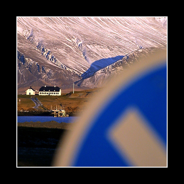
| I am so unhappy about how low this finished! Only 3 other ppl agreed that this was an awesome shot? Maybe because the sign wasn't the subject. It is more of a distraction really, but the background is just so gorgeous that I can't blame you for focusing on it. I like the bold border too. |
|
Comments Made During the Challenge  |
|
|
01/26/2003 11:36:00 PM |
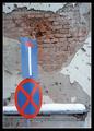
| way to big of a border..the sign is out of focus |
|
|
|
01/26/2003 04:01:39 PM |
| Difficult shot, might have liked the sign a bit more in focus so you knew what it was without the title. |
|
|
|
01/26/2003 12:12:55 PM |
| I hate the wide border. However I really like the pic. The color of the mountains is awesome. Great perspective shot. Really well done - Inspzil |
|
|
|
01/25/2003 01:39:05 PM |
|
|
|
01/25/2003 10:47:23 AM |
| Nice unique idea and well exectuted. Beautiful scene! |
|
 Photographer found comment helpful. Photographer found comment helpful. |
|
|
01/25/2003 07:54:57 AM |
| I think you should have tried to get the sign in focus too. |
|
|
|
01/25/2003 02:05:45 AM |
| An interesting photo. I like it because it is different from the other submissions, but yet the out-of-focus sign in the forground is more a distraction than it is a contributing element. Maybe if it were just a little more in focus, and occupied a smaller percentage of the scene. Also, I think the huge black border is a bit of a distraction - a little too much border for this image. Still, I like it. 7 md |
|
|
|
01/23/2003 08:54:30 AM |
| Scenery on hand like this gives you a huge advantage. I don't see anything achieved by throwing in a blurred sign. Looks like a spectacular landscape, with something blocking the bottom right corner. |
|
|
|
01/22/2003 08:22:42 PM |
| That looks like a really nice view. It's a pity the sign is so out of focus. |
|
|
|
01/22/2003 07:10:42 PM |
|
| Photographer found comment helpful. |
|
|
01/22/2003 06:39:00 PM |
| Good concept and composition, however, the blur of the sign is distracting. It may have been done deliberately, but it somehow doesn't seem to enhance the overall effect for me. |
|
|
|
01/21/2003 05:02:34 PM |
| I think this picture would have been positively awesome if you had used a different DOF, putting your aperture at highest it would go, would have allowed the sign to be in focus as well as the background. The colors here are great, as are you use of composition. The sign being out of focus is just really bothersome though. Nice creative use of the challenge. -8- good luck! |
|
| Photographer found comment helpful. |
|
|
01/21/2003 03:33:48 PM |
| I find the border way too wide |
|
|
|
01/21/2003 02:56:46 PM |
| Interesting perspective. I may have included less of the sign in the image, but I still really like the idea. Great colors as well. |
|
| Photographer found comment helpful. |
|
|
01/21/2003 04:19:25 AM |
good composition, I like it.
|
|
| Photographer found comment helpful. |
|
|
01/20/2003 11:00:59 PM |
| Why do I have a feeling this is an Arnit shot? Artistic as usual. I like it. |
|
| Photographer found comment helpful. |
|
|
01/20/2003 07:29:38 PM |
|
|
|
01/20/2003 07:02:02 PM |
| Beyond neat......fantastic idea. Creative brain with wonderful colors....wow that light is just not seen here in the PNW. |
|
| Photographer found comment helpful. |
|
|
01/20/2003 05:09:46 PM |
| This is an interesting photo. The black and white border complement the black and white house well - which appears to be the focal point of the image. The blurred effect of the sign actually comes across quite well. Good job. |
|
| Photographer found comment helpful. |
|
|
01/20/2003 02:39:00 PM |
| Gorgeous. Great use of the lines and the sign for the challenge. (8) |
|
| Photographer found comment helpful. |
|
|
01/20/2003 10:11:37 AM |
| more like living under the mountain! :-) |
|
|
|
01/20/2003 02:31:07 AM |
| You should have submitted this one to "landscapes", sans the sign. It's really very nice, but I don't see how it really fits our challenge. |
|
|
|
01/20/2003 01:11:17 AM |
| This border really kills the picture for me; it's just too big. |
|
Home -
Challenges -
Community -
League -
Photos -
Cameras -
Lenses -
Learn -
Help -
Terms of Use -
Privacy -
Top ^
DPChallenge, and website content and design, Copyright © 2001-2025 Challenging Technologies, LLC.
All digital photo copyrights belong to the photographers and may not be used without permission.
Current Server Time: 03/12/2025 08:53:13 AM EDT.