| Author | Thread |
|
|
10/29/2004 09:17:13 AM |
B.O.T.P.A.C.
Bottom of the Pack Analytical Comments
Every challenge I am going to leave comments on some of the photos that finished at the bottom of the pack. I will try and explain why I think the photo did not do well in the challenge, which will hopefully result in increased rankings in your future photos.
-Ben
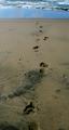
1) Image Quality. The photo is overly compressed and is not in focus. These are basic presentation issues and will almost always result in lower votes.
2) Post Processing. The photo is washed out with not much contrast and no black areas at all. This means the photo isn't as eye-catching.
3) Composition. The background is cluttered, the vertical lines are not vertical, and it is very centered. Most voters like simple clean and technically perfect shots in the majority of cases. |
|
 Photographer found comment helpful. Photographer found comment helpful. |
Comments Made During the Challenge  |
|
|
10/25/2004 05:06:10 AM |
| Looks like camera shake and the door in the background has degraded a potentially good image. 3 |
|
| Photographer found comment helpful. |
|
|
10/24/2004 10:52:50 PM |
|
| Photographer found comment helpful. |
|
|
10/24/2004 01:27:03 AM |
| The idea is ok, but the execution is week. The composition, the pose, seems awkward. If the focus were tighter, it would also improve the picture. |
|
| Photographer found comment helpful. |
|
|
10/23/2004 02:58:01 PM |
| I think this photo has some technical quality issues...lots of grain and a soft focus, which can be nice at times (but I don't think it works well here). |
|
| Photographer found comment helpful. |
|
|
10/23/2004 09:15:07 AM |
| I think this image needs to be a bit more focused. It seems a bit blurry but not for any particular effect |
|
| Photographer found comment helpful. |
|
|
10/23/2004 07:20:48 AM |
| THis is a good memory for most of us, I have my reservations on the quality of the image but for the idea and photography I'll rate it better than normal |
|
| Photographer found comment helpful. |
|
|
10/23/2004 12:21:22 AM |
| Out of focus. Composition not very appealing, showing the student with the book would probably have helped. |
|
| Photographer found comment helpful. |
|
|
10/22/2004 11:48:02 PM |
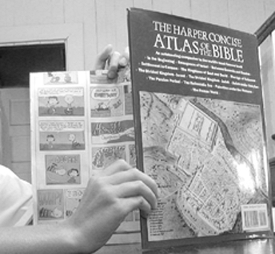
| Love the idea! It's exactly the sort of thing that reminds me of school without being overdone. The photograph looks a little too posed though...I'd like to see an alternate version taken from over the reader's shoulder (right where a teacher would sneak up and catch him/her in the act). Instead of using the book cover to indicate what the book is, you could have the comics only cover part of the page, leaving some sort of recognizable chart or illustration exposed. |
|
| Photographer found comment helpful. |
|
|
10/22/2004 01:39:39 PM |
| I like the idea represented here, but the quality is really lacking, I'm afraid. |
|
| Photographer found comment helpful. |
|
|
10/22/2004 01:33:07 PM |
| Good take on the subject! The B&W seems to gray and you also get a glare off the book which distracts the eye. Also the models hand is not sitting very natural upon the book. |
|
| Photographer found comment helpful. |
|
|
10/22/2004 02:41:02 AM |
| Good concept for the photo, however it just didn't work for me over all. It almost looks like the whole focus here was on the hand and not the whole picture, I find the cartoon and the atlas out of focus/distorted. The reflection on the book cover is also distracting, the things we learn. That's just my humble opinion. Don't give up were all here to learn. |
|
| Photographer found comment helpful. |
|
|
10/22/2004 02:18:11 AM |
| looks like it was taken with a picture phone, good concept though |
|
| Photographer found comment helpful. |
|
|
10/21/2004 02:03:30 PM |
| a little out of focus. I feel this could have been both good and humorus . |
|
| Photographer found comment helpful. |
|
|
10/20/2004 09:06:50 PM |
|
| Photographer found comment helpful. |
|
|
10/20/2004 04:55:45 PM |
|
| Photographer found comment helpful. |
|
|
10/20/2004 04:48:47 PM |
|
| Photographer found comment helpful. |
|
|
10/20/2004 01:03:41 PM |
|
| Photographer found comment helpful. |
|
|
10/20/2004 03:22:20 AM |
| Good idea but image quality isn't good. |
|
| Photographer found comment helpful. |
Home -
Challenges -
Community -
League -
Photos -
Cameras -
Lenses -
Learn -
Help -
Terms of Use -
Privacy -
Top ^
DPChallenge, and website content and design, Copyright © 2001-2025 Challenging Technologies, LLC.
All digital photo copyrights belong to the photographers and may not be used without permission.
Current Server Time: 03/12/2025 02:44:26 AM EDT.