| Author | Thread |
|
|
09/17/2014 07:01:03 AM |
Critique Club Comment:
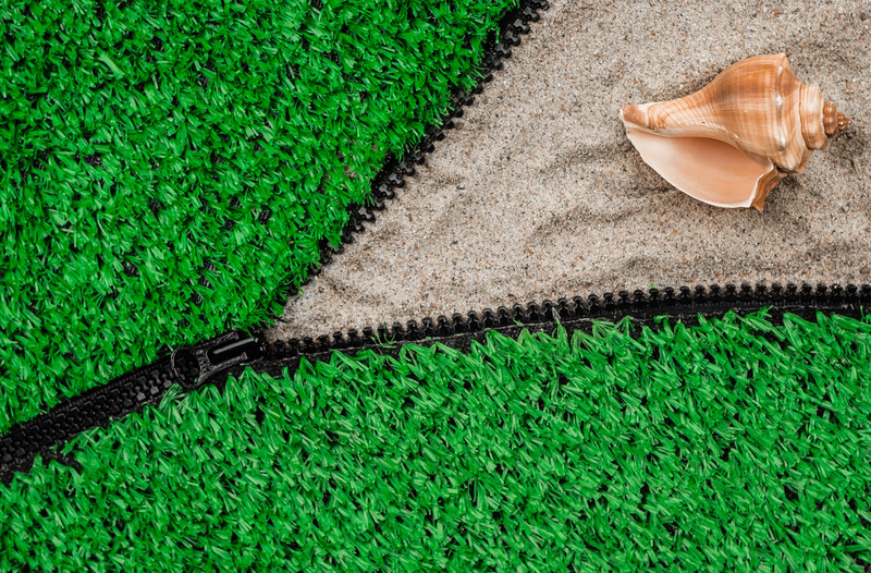
I really liked this one a lot. The green grabs you and offsets the sand and shell nicely. Composition is very good, though I would have preferred the zipper to lead from the corner rather than the edge. The shell might have been better placed in the center of the spread of the zipper, more towards the crossing of 1/3 lines, or a second object placed there. Regardless, the shell feels like it's too close to the edge given all the sand. As I mentioned below, I'd also like to have had the green on the top zipper pushed back so that it exposed the teeth as with the zipper below.
A fine image that I gave a 7. A very deserving top 10. |
|
 Photographer found comment helpful. Photographer found comment helpful. |
Comments Made During the Challenge  |
|
|
09/13/2014 04:24:34 PM |
| This looks really awesome!! Great execution and cool idea. Very colorful and unique. |
|
| Photographer found comment helpful. |
|
|
09/09/2014 03:44:12 AM |
| Cool idea. Would have liked to see some of the green pulled away from the left side where it splits. |
|
| Photographer found comment helpful. |
|
|
09/08/2014 10:07:57 PM |
| How creative is this! This has been awesome to see and different a bit bright on the bottom but the thought is there... very different and yes I love things like this |
|
| Photographer found comment helpful. |
|
|
09/08/2014 03:43:32 PM |
|
| Photographer found comment helpful. |
|
|
09/08/2014 02:53:44 PM |
| This is an excellent concept, and well executed. Hope it does well. |
|
| Photographer found comment helpful. |
Home -
Challenges -
Community -
League -
Photos -
Cameras -
Lenses -
Learn -
Help -
Terms of Use -
Privacy -
Top ^
DPChallenge, and website content and design, Copyright © 2001-2025 Challenging Technologies, LLC.
All digital photo copyrights belong to the photographers and may not be used without permission.
Current Server Time: 03/10/2025 03:20:15 PM EDT.