Hi, welcome from the Critique Club!!
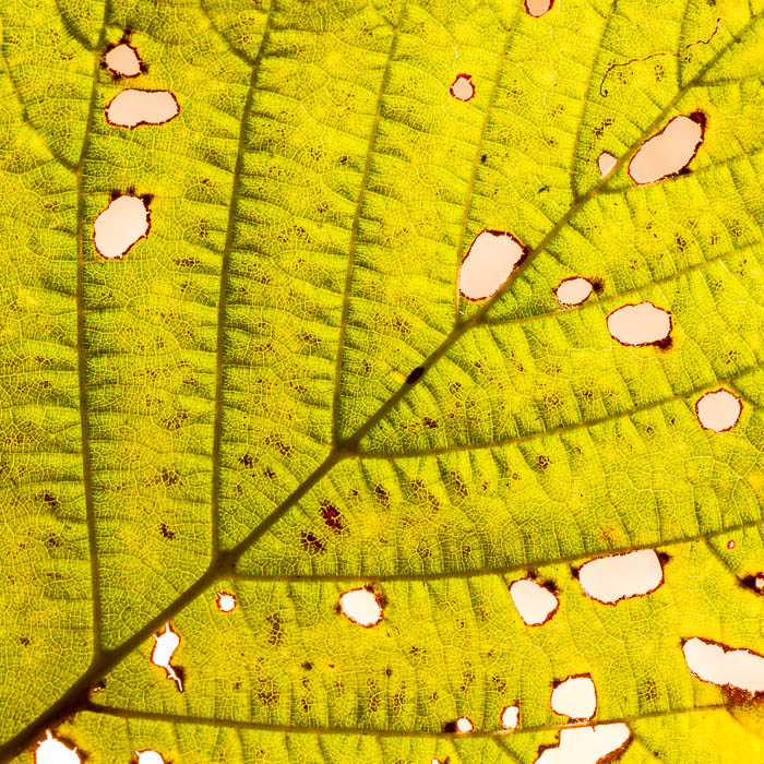
For this challenge, you submitted a really beautiful leaf with lots of good character and detail! I think that the obvious shortcoming of the image is, as the other comments allude, that there really are no obvious right angles...which is what the challenge was about. Had the veins in the leaf been at the right angle, I suspect your image would have done so much better!
Subject aside, I feel the image is a little to over-processed. The colors are too saturated for my liking, and come across as unnatural. The background is this odd color (pinky-yellow) which is not quite complimentary either. I know you mention this is a contre-jour image, which sometimes works and sometimes doesn't. I certainly feel the latter is the case here, as the backlighting doesn't really contribute anything to the shot. Perhaps choosing a leaf on a background with more color (red/green/blue) could've given you a little more pop?
All in all, I think you received a fair score for the image. As a new member to DPC, I would certainly encourage you to try meet the challenge topic a little more clearly in future as the DPC voters are sometimes a literal bunch and don't like variations/different interpretations on the challenge theme.
Hope this critique has helped. Feel free to PM me if you'd like to discuss any of it further!
Kind regards,
Garry
|