| Author | Thread |
Comments Made During the Challenge  |
|
|
11/06/2014 11:18:26 AM |
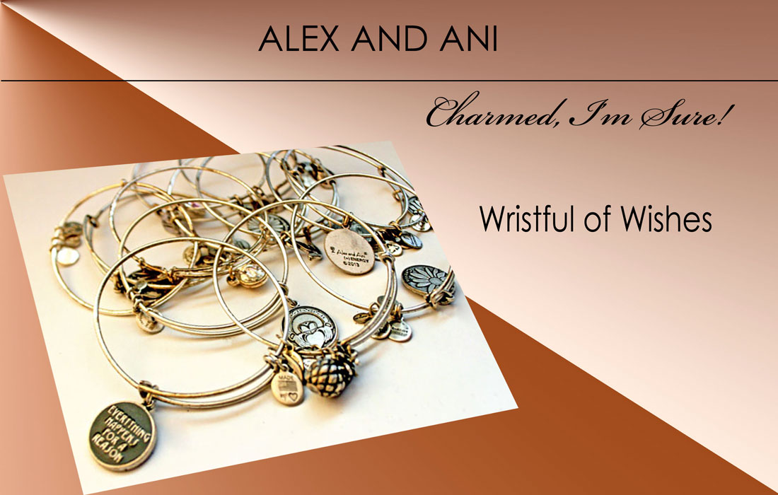
| The pile of stuff is to busy and none of it seems to really be in focus. Would have been more effective if you had something tack sharp with a really small DOF and everything else blurred. Like move the charm from the bottom left up and had it in perfect focus. |
|
 Photographer found comment helpful. Photographer found comment helpful. |
|
|
11/05/2014 08:36:07 AM |
| Nice edit - really nice. I just wish the entire photo was sharp throughout. |
|
| Photographer found comment helpful. |
|
|
11/03/2014 09:48:52 AM |
| Nice - well arranged and good looking design. |
|
| Photographer found comment helpful. |
|
|
11/01/2014 09:54:15 PM |
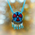
For a jewelry advertisement, the jewelry has to be tack sharp! I struggled to read the lower left words... and I'm disappointed since I like everything about this "ad" except for the photograph. But... it's a photography challenge, in the end.
6 |
|
| Photographer found comment helpful. |
|
|
11/01/2014 05:25:21 AM |
| Slick graphic design, but the photography element lacks the crispness that I feel the design needs. |
|
| Photographer found comment helpful. |
|
|
10/31/2014 04:56:36 PM |
| Interesting idea, nice graphics. But the cropped hoops really wrecks it for me. |
|
| Photographer found comment helpful. |
|
|
10/31/2014 12:11:04 PM |
| Having so many bracelets gives a busy feel, and the focus seems a bit off. |
|
| Photographer found comment helpful. |
|
|
10/31/2014 08:19:59 AM |
| I think your layout somewhat takes away from the product itself. Good effort though. |
|
| Photographer found comment helpful. |
Home -
Challenges -
Community -
League -
Photos -
Cameras -
Lenses -
Learn -
Help -
Terms of Use -
Privacy -
Top ^
DPChallenge, and website content and design, Copyright © 2001-2025 Challenging Technologies, LLC.
All digital photo copyrights belong to the photographers and may not be used without permission.
Current Server Time: 04/25/2025 03:36:09 PM EDT.