I always liked this old image which I made using old drawing class baggage, a concept containing the efficiency and purity of a fundamental guide to composition. The picture is pure design, any other implications are your own fault.
The edit is limited to straighten, crop tool was not employed; contrast & sharpen adjustment; b&w conversion & adjust.
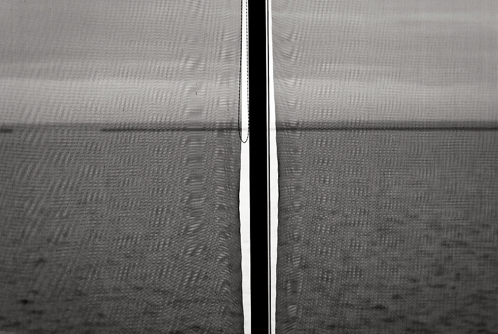
The image is a view of Lake Michigan taken from an interior room through a window covered with closed, loose woven cloth blinds.
The primary component of design that I noticed when observing this scene (an element I notice in many scenes, and many windows in particular) is the grid - It might be called a cross, but that description to a great extent is limiting in that it neglects the visual whole and negates the concept of a continuum.
The picture is interesting because it contains multiple layers of grids -
The first: anchored by the vertical central black bar and the horizontal faint sea wall. Second: the loose open woven blinds themselves. Third: the moiré, an optical event, left uncontrolled, layering an overall pattern.
Fourth: (not part of the picture, but a thought that occurred during editing for this challenge) the opaque liquid veil of the water, the lake, covering the matrix of thousands of images which could have been chosen and were never looked at.
The detail or lack of detail is important as some have noted ie. the gap in the sea wall and the dangling blinds pull chain. These elements provide some visual relief and some very slight whimsy, far from what Paul Klee might provide.
My picture also lacks the spontaneity of a grid by Imagineer Or design persistence and repetition of Jean-Jacques Béguin
Statistics
Place: 234 out of 264 Avg (all users): 4.9726 Avg (commenters): 7.7500 Avg (participants): 5.0427 Avg (non-participants): 4.6897 Views since voting: 394 Views during voting: 244 Votes: 146 Comments: 15 Favorites: 1 (view)
I forgot to mention that the picture would be diminished, less interesting, without the gap in the left half ... presumably a breakwater entrance. But it's there, so it isn't.
Reminds me of something by Kertesz. Martinique, I think it was. Not that this is a copy of that, but it has the same teeter between banal and thrilling, clarity and obscurity, real and surreal. That's probably some kind of photo-cubism idea, but I don't know enough about art to say, really. But, as they say in the comics, I know what I like. And I like this.
So now I'm back for a final look before rollover, and I enjoy it more with every encounter. Weird, that, because at first glance you'd think there was so little present in the picture that one reasonable consideration would soak up all it has to offer. But no. It's the opposite. It raises so many tantalising questions of dichotomy, of the real versus the surreal sides of the same coin, that it seems to expand in the viewer's mind (well, in my mind, which is the only one I can access). It's like a visual version of the meditator's mantra. Empties the mind, and then fills it.
Only one possible score, a 10. And firmly attached to that, the Order of the Thumb. Thank you.
This image has caused me to stop and pay attention. That means it is in my 7-10 voting band. (Voted earlier)
Additionally, it is highly interesting/eclectic meaning it keeps me here long enough to offer a longer comment and a vote of 8 or more.
This is one of my 8s - I like it. Furthermore I think it enriches the DPC collective portfolio. Put simply, I wish we saw more stuff like this. Let me tell you why it pushes all the right buttons for me:
1. The 'aha' moment when the picture clicks.
2. The moire as a feature.
3. The slightly off-centre frame.
4. The ambiguity of the scene - I see the sea, a sea wall and a harbour entrance. I wonder whether we are coming or going. Or already there.
5. The flat tones - excluding the contrasty centre.
6. The daring submission into a DPC challenge!
I love this. Love the textured drape. Love the black and white break down the middle. Love the tones and how they make up the image. Most of all I love the little hanging chain. 10
Good eye to capture the abstract potential in a potentially mundane scene. Upright black post crosses thin horizontal line (would echo a religious cross if the tiny horizontal black bit were cropped off the left, but leaving that anchors this as a partly environmental abstract showing harbor exit), white vertical elements contrast with light grey sky, texture of shade/screen material interacts with texture of water surface. Not eye candy, so at risk of ending with lower score than justified by artistic merit.