| Author | Thread |
Comments Made During the Challenge  |
|
|
10/26/2004 10:25:18 PM |
| This shot just does not do it for me. Subject is, well, a bit boring for me. Good luck anyway. |
|
|
|
10/26/2004 08:35:21 PM |
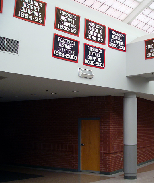
| Very ominous - what with the name and the dark hallway. My first thought is of a crime scene. |
|
|
|
10/25/2004 03:20:27 AM |
| that is just strange... but intriguing |
|
 Photographer found comment helpful. Photographer found comment helpful. |
|
|
10/24/2004 10:54:10 PM |
|
| Photographer found comment helpful. |
|
|
10/24/2004 12:48:05 AM |
Well the picture is exceptionally ordinary, but I do like the morbid humour
(Cringe)
|
|
| Photographer found comment helpful. |
|
|
10/23/2004 02:40:12 PM |
| I think the crop on this photo could have been better. I don't like the way the sign at the side is cut half way through, and on the other side of the photo, there's just a bit of a frame for another sign. They'd have been better cropped right out in my opinion. |
|
| Photographer found comment helpful. |
|
|
10/21/2004 03:16:23 PM |
| The bottom half of this picture doesn't add much to it, I might have stepped back to get more banners, including those on the right-hand wall for purpose of adding more dimensions and depth, and then cropped it to be a fairly long, narrow horizontal photo. |
|
| Photographer found comment helpful. |
|
|
10/21/2004 12:54:11 PM |
| It just didn't grab my attention. Good angles good lighting. I just couldn't get exited. |
|
| Photographer found comment helpful. |
|
|
10/21/2004 12:46:54 PM |
| This does meet the challenge but it does so in a very dull and literal way, IMO. This might be of some interest to the students at this school who care about sports and want to know the recent history of their team but there really isn't anything here to attract an impartial viewer's interest. The signs themselves are not striking in any way (to me, anyway) and most of the frame is taken up with the ugly institutional building. |
|
| Photographer found comment helpful. |
|
|
10/21/2004 01:03:51 AM |
| The composition of this short requires some more thought. |
|
| Photographer found comment helpful. |
|
|
10/20/2004 04:34:33 PM |
| a tighter crop of the banners would have worked better - the hallway doesn't add to the photo |
|
| Photographer found comment helpful. |
|
|
10/20/2004 04:26:29 PM |
| The signs don't do enough to make me feel nostagic or inspired by the theme. 4, just-married |
|
| Photographer found comment helpful. |
Home -
Challenges -
Community -
League -
Photos -
Cameras -
Lenses -
Learn -
Help -
Terms of Use -
Privacy -
Top ^
DPChallenge, and website content and design, Copyright © 2001-2025 Challenging Technologies, LLC.
All digital photo copyrights belong to the photographers and may not be used without permission.
Current Server Time: 03/12/2025 09:13:27 PM EDT.