| Author | Thread |
Comments Made During the Challenge  |
|
|
10/26/2004 05:00:34 PM |
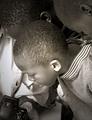
| I think this effort, while it tells a story and meets the challenge, is a little too dark. Maybe adjust the levels and boost the contrast up a little bit. |
|
 Photographer found comment helpful. Photographer found comment helpful. |
|
|
10/26/2004 09:02:35 AM |
The composition is very good and isolates the subject well. Black and white is so hard and very subjective. I changed the curve in PS and it immediately gave it more impact -
I like this picture very much |
|
| Photographer found comment helpful. |
|
|
10/25/2004 06:13:57 PM |
| The black and white is cool, but I'd like better lighting on the guy, and a little more overall brightness. |
|
| Photographer found comment helpful. |
|
|
10/23/2004 12:10:22 PM |
| Lacking in contrast, but a good concept |
|
| Photographer found comment helpful. |
|
|
10/23/2004 06:37:20 AM |
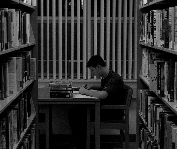
| I like this shot. It is a little busy, but the lines all lead right to the subject. |
|
| Photographer found comment helpful. |
|
|
10/22/2004 01:10:34 PM |
|
| Photographer found comment helpful. |
|
|
10/22/2004 12:24:17 AM |
| good concept - moving back and using a long lens for perspective would have made this more powerful |
|
| Photographer found comment helpful. |
|
|
10/21/2004 09:38:12 PM |
| This would have been even better in color, in my opinion. |
|
| Photographer found comment helpful. |
|
|
10/21/2004 05:04:34 PM |
| too dark, but good composition |
|
| Photographer found comment helpful. |
|
|
10/21/2004 04:36:37 PM |
| I like the setting, the framing, and the studious attitude of the subject. However, it shows up very dark, even on my "other" well-calibrated monitor. I think this could be fixed in processing as it seems that the tonal range is all there. |
|
| Photographer found comment helpful. |
|
|
10/21/2004 01:10:38 PM |
| the photo is to crowded. and takes away from the center of intrest |
|
| Photographer found comment helpful. |
|
|
10/21/2004 01:35:56 AM |
|
| Photographer found comment helpful. |
|
|
10/20/2004 07:04:30 PM |
| The bookshelves drawing us back to your subject are great. Too bad the blinds make the background stand out so much, but there's not a whole lot to be done about that. Libraries are libraries. |
|
| Photographer found comment helpful. |
|
|
10/20/2004 04:42:13 PM |
|
| Photographer found comment helpful. |
|
|
10/20/2004 01:12:30 PM |
| Compozition is real nice but need to add more brightness. |
|
| Photographer found comment helpful. |
|
|
10/20/2004 12:51:27 AM |
|
| Photographer found comment helpful. |
Home -
Challenges -
Community -
League -
Photos -
Cameras -
Lenses -
Learn -
Help -
Terms of Use -
Privacy -
Top ^
DPChallenge, and website content and design, Copyright © 2001-2025 Challenging Technologies, LLC.
All digital photo copyrights belong to the photographers and may not be used without permission.
Current Server Time: 03/12/2025 01:13:49 AM EDT.