DPChallenge: A Digital Photography Contest You are not logged in. (log in or register
 
Challenge Entries
This image is not a part of any challenge.
Portfolio Images
Chateauneuf du Pape_2127
crik


Photograph Information Photographer's Comments
Collection: PAW
Camera: Nikon D750
Lens: Nikon AF-S Nikkor 50mm f/1.8G
Aperture: 4.0
ISO: 64
Shutter: 2.5
Date Uploaded: Mar 12, 2015

Viewed: 466
Comments: 7
Favorites: 0

I shot this one for the jjbeguin challenge but did not enter because it looked too dark on my iPad. It did not look as dark on my PC.
It would be helpful for me to know what you see on your monitors and think ... too dark?

Please log in or register to add your comments!

AuthorThread
03/29/2015 11:32:16 PM
I really like this image to me its perfect shade of darkness, the textures make this work
03/22/2015 11:01:39 PM
Thanks again for all the helpful comments.
I will try the auto tone/contrast/color in PS, pixelpig. Good idea to check it in b/w too. I tried to tease out the lower edge of the bottle by dodging but it didn't help. The photo was taken in a room with a very little window light with slow shutter and light painting with a flashlight. A little more light on the bottom would have brought it out better. It was fun to play with and the glass of wine was good too. 😊
03/22/2015 06:58:01 PM
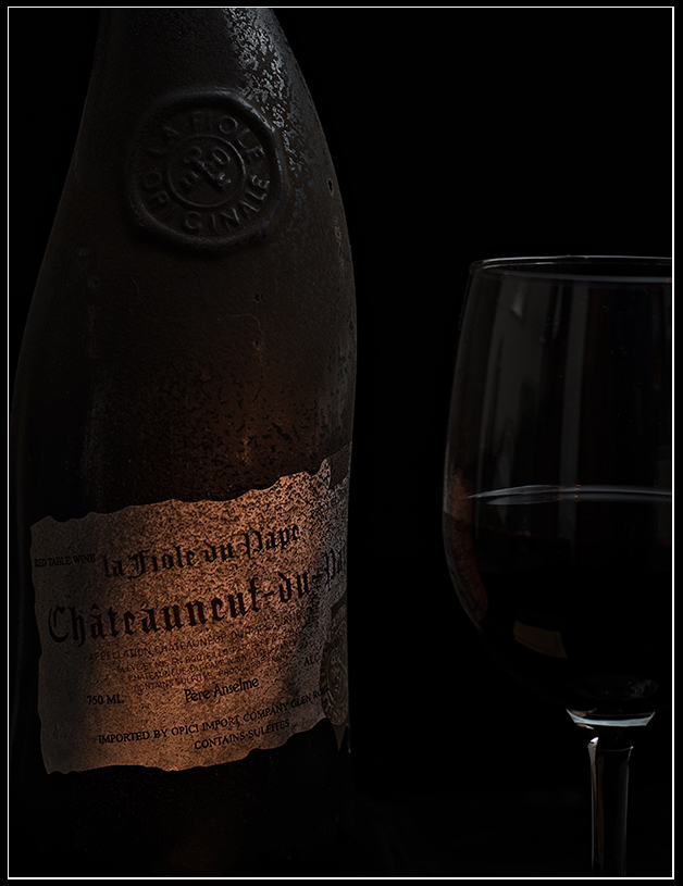
I can see the bottle, which is plainly very old, and the clean wine glass with it's reflections & the very dark wine. Under the subject of "too dark" for me the wine in the glass is suspiciously dark. But I would not describe the image as too dark, no.

It might be worth your time to try this experiment--try auto-tone, auto-contrast & auto-color adjustments in photoshop, just to see what you get. Also, use the curves adjustment layer & the Auto button, see what that gives you. And what it looks like on your various monitors. It can be useful to look at it in BW, just to see it without the distraction of color. Just for fun.

It's well within my own comfort zone to look at. My eyes are willing to accept it as an intentionally dark image. Perhaps because of your lighting & the label, the bottle seems to go a bit 2-dimensional at the bottom, probably because the edge of the bottle is not there. Kind of gives it a surreal look.
  Photographer found comment helpful.
03/15/2015 05:47:11 PM
I like dark images. I can see the bottle and the glass, so it is not too dark in my opinion.
  Photographer found comment helpful.
03/14/2015 09:51:24 PM
Thanks for the comments, glad to hear that it isn't too, too dark. I will print it out.
The bottle is very old looking and unique. It's a good one too. :)
03/14/2015 06:47:02 PM
It's dark, but not too dark. Bottle is completely visible. Looks great on my phone (Android) and my monitors (a good and a bad one). And of course there's nothing wrong with a nice Chateauneuf du Pape ;)
  Photographer found comment helpful.
03/14/2015 12:03:20 PM
I shows pretty dark on my screen. I find it to be a very compelling image, the bottle looks so old and is a unique contrast against the clean smooth wine glass. I bet this would make a good print, a wine lover would be happy to hang this up in their home or office.
  Photographer found comment helpful.


Home - Challenges - Community - League - Photos - Cameras - Lenses - Learn - Help - Terms of Use - Privacy - Top ^
DPChallenge, and website content and design, Copyright © 2001-2025 Challenging Technologies, LLC.
All digital photo copyrights belong to the photographers and may not be used without permission.
Current Server Time: 04/25/2025 08:42:39 PM EDT.