| Author | Thread |
|
|
01/28/2005 02:56:22 PM |
|
|
|
02/09/2003 10:52:34 PM |
~Critique Club Comment~
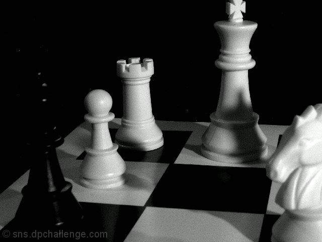
COMPOSITION- Composition is kind of harsh on this one. The king is a little tightly cropped on top and lighting is a little dark on the black king. It is hard to make out what it was. I think you should have lined up the camera with the back of the board to make kind of a horizon. It is tilted as is. I love the whole chess theme and the shadows from the white players are great.
BACKGROUND- Not much to the background. Having it black cuts down on distractions greatly.
CAMERA WORK- Your focus is great. I think a tad longer shutter speed would have lightened it up a little bit.
POST PROCESSING- Post processing is nice. The sharpness is perfect. There is some noise in the whites, but nothing too distracting.
MY OPINION- It's always great to win a game of chess. This is nice and I would have given it a 5. Just straighten up a few things and you have a great shot. |
|
Comments Made During the Challenge  |
|
|
02/01/2003 06:04:52 AM |
| Check out //www.m-w.com to spell "imminent" correctly, and then check out //www.neatimage.com/ and download Neat Image to get rid of all that noise; it works wonders. Besides that, the black piece blends into the background so i can't tell what it is. I'm guessing the Queen, but try adjusting brightness and contrast to bring more details out, and use a greater depth of field to keep everything in focus. |
|
|
|
01/31/2003 03:10:34 PM |
| hi this could be better if the black chess piece wasn't not too black and the king is too tightly cropped. |
|
|
|
01/29/2003 01:59:16 PM |
| Very nice job on using shadows in your picture. The lighting you used is very creative. I also think that having the board on an angle also gives the picture a nice display. Nice job |
|
|
|
01/29/2003 10:40:17 AM |
| good use of the word square |
|
|
|
01/29/2003 12:44:39 AM |
I feel the black piece is a little too dark and the crop too tight on the taller piece. What I assume is a soft focus adds to the feel of the b&w imagery.
|
|
|
|
01/28/2003 07:47:59 PM |
| It would really benefit by using more of the alloted 150kb file size though. That would sharpen it a lot. The shadow on the white King is a bit of a distraction as well. |
|
|
|
01/28/2003 07:20:39 PM |
| it's blurry, maybe some other point of view would have been more interesting |
|
|
|
01/27/2003 09:05:15 PM |
| I just don't like the lighting on this one. Sorry. |
|
|
|
01/27/2003 10:44:13 AM |
| Crisp shot but the shadows are a little distracting.. Cub |
|
|
|
01/27/2003 08:34:13 AM |
| Your photo wouldnt open for me , I will be back |
|
|
|
01/27/2003 07:52:09 AM |
| Its difficult to say what the black piece is so defeat for who ? or maybe thats the point? |
|
|
|
01/27/2003 06:46:05 AM |
| Picture seems a bit dark. |
|
|
|
01/27/2003 02:45:35 AM |
| Needs to be brighter. I'm assuming that dark black piece is the King, but the pic lacks the full effect because you can't see the bottom area (where the King could move). |
|
Home -
Challenges -
Community -
League -
Photos -
Cameras -
Lenses -
Learn -
Help -
Terms of Use -
Privacy -
Top ^
DPChallenge, and website content and design, Copyright © 2001-2025 Challenging Technologies, LLC.
All digital photo copyrights belong to the photographers and may not be used without permission.
Current Server Time: 03/14/2025 04:59:31 PM EDT.