| Author | Thread |
|
|
02/09/2003 10:52:35 PM |
Critique Club:
Meeting the Challenge: Excellent job of this!
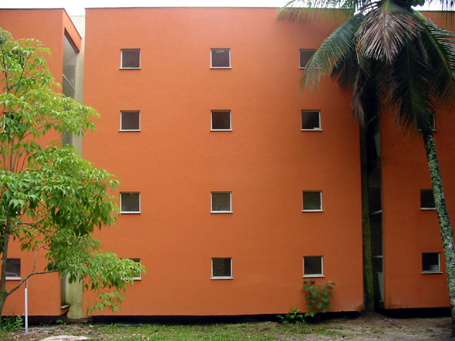
Composition: I wonder what this had looked like with only one window as a focal point with maybe that window on the left framing it? It is difficult to understand the photo without knowing the challenge. I do like the use of contrasting colors. Might have cropped out the top due to the "hot" lighting up over the roof. Although the group of square windows are somewhat framed by the other things in the photo. I do like the repeating patterns with the windows somewhat.
Technical Quality: The lighting is a bit uneven, the bottom bush a bit out of focus (windy day maybe?). No grain or post-processing problems noticed. Fairly clear shot overall.
Creativity: Interesting idea for the challenge, although no real outstanding creativity seen in the shot.
Conclusion: Well done photo, meets the challenge, may have used a little more energy/mood qualities to increase interest.
Hope this helps@! If you have questions, do not hesitate to p-mail me.
|
|
Comments Made During the Challenge  |
|
|
02/02/2003 09:17:06 PM |
| Now there's some straightforward architecture ... |
|
|
|
02/02/2003 06:17:00 PM |
| I like the color and contrast. What if you shot this with only the building v- no veg? |
|
|
|
02/01/2003 02:25:10 PM |
| You got that right. Looks almost like a prison or hospital. Which ever it is plain and dull. Great find. Photo seems a little light on the left upper corner and a little dark on the right side. Don't know how you could help that except wait on the perfect time of the sun, which may never come. Nice work. |
|
 Photographer found comment helpful. Photographer found comment helpful. |
|
|
01/31/2003 11:55:12 AM |
| The sun above the building is hurting this shot. It's very well taken, but I'm not wild about the composition. There really needs to be some focal point to this pic. - Inspzil |
|
|
|
01/30/2003 02:30:43 PM |
Composition: Seems slightly convex?
Technical: Nice focus/quality. Right tree looks a little dark?
Meets challenge: Yes
Overall impression: Nice colours and a good pic. 6 |
|
| Photographer found comment helpful. |
|
|
01/30/2003 02:22:07 PM |
| I like the trees and the range of colors. I also like how all the squares are spaced even on the building. |
|
|
|
01/29/2003 08:33:01 PM |
| A bit faded at the top. I think a different angle would have made a better photo. Perhaps cropping to the one building (get rid of the division between building sections?). |
|
|
|
01/29/2003 10:12:41 AM |
| your image is neat but it is very plain |
|
|
|
01/28/2003 01:37:31 PM |
| I may have been tempted to crop the sky out of this one... otherwise pretty cool! |
|
| Photographer found comment helpful. |
|
|
01/28/2003 12:35:07 PM |
| Fantastic find, good eye. Wow the color. A better crop would of helped this shot to a ribbon. |
|
| Photographer found comment helpful. |
|
|
01/27/2003 02:29:29 PM |
| The composition could be improved. It's a perfect subject to meet the challenge though. |
|
| Photographer found comment helpful. |
|
|
01/27/2003 12:27:22 PM |
| If you had a wide angle lens, I would have shot just four of the windows. The scope of the photos is too large. You could even have a good composition if you just took a shot of one. |
|
| Photographer found comment helpful. |
|
|
01/27/2003 03:21:39 AM |
| I dont know what it is about this picture that i like, I just do. Sorry for the useless comment, but i try to comment on them all. I find things to say about most. This one is just good. caught my eye and held my attention. |
|
|
|
01/27/2003 01:30:50 AM |
|
Home -
Challenges -
Community -
League -
Photos -
Cameras -
Lenses -
Learn -
Help -
Terms of Use -
Privacy -
Top ^
DPChallenge, and website content and design, Copyright © 2001-2025 Challenging Technologies, LLC.
All digital photo copyrights belong to the photographers and may not be used without permission.
Current Server Time: 03/11/2025 01:33:41 PM EDT.