| Author | Thread |
|
|
02/09/2003 04:41:50 PM |
A visit from the critique club :)
This photo does not really do much for me. Sure, it meets the challenge but it does not engage me. The focus is a bit off. The image looks soft. There's also noise in the sky.
The exposure is pretty good. I would like to have seen several different angles on this. |
|
 Photographer found comment helpful. Photographer found comment helpful. |
Comments Made During the Challenge  |
|
|
02/01/2003 06:11:14 AM |
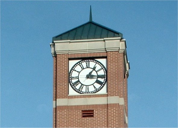
Composition: Would have cropped the sky either side of the tower fairly tight myself.
Technical: Not perfect focus, but I guess that's due to distance.
Meets challenge: Yes
Overall impression: I like architecture, but is lacking interest slightly, for me. Shape of the pic really gives a snapshot quality (sorry). Always worth considering cropping. 6 |
|
| Photographer found comment helpful. |
|
|
01/31/2003 01:46:40 PM |
| I like how the lines in this photo draw your eye upward. There is too much negative sky space. |
|
| Photographer found comment helpful. |
|
|
01/30/2003 10:53:35 PM |
| I am seeing some noise in the sky part of your picture, and I suspect that could cause the tower to look slightly out of focus. If you haven't used it, NEATIMAGE does a wonderful job with noise in a photo. |
|
| Photographer found comment helpful. |
|
|
01/30/2003 05:17:21 PM |
| Beautiful tower. The light is good and the cropping is ok. The focus appears to be a bit soft, especially on the clock itself. It seems to loose focus as you go up the tower. The bottom appears to be ok. Nice shot, just need a little better execution. |
|
| Photographer found comment helpful. |
|
|
01/30/2003 04:00:49 PM |
| This photo does contain a square, but I don't think that it is a good representation of the concept. The picture doesn't seem to be too creative. It is a very nice photo of a clock tower. |
|
| Photographer found comment helpful. |
|
|
01/29/2003 08:43:08 PM |
|
| Photographer found comment helpful. |
|
|
01/29/2003 08:08:02 PM |
| Good picture, but not much originality. |
|
| Photographer found comment helpful. |
|
|
01/29/2003 03:44:21 PM |
| Perhaps a vertical orientation would have helped. This photo also seems too soft. |
|
| Photographer found comment helpful. |
|
|
01/29/2003 02:42:58 PM |
| lots of squares. too much negative space |
|
| Photographer found comment helpful. |
|
|
01/29/2003 02:40:34 PM |
| Very good subject. Try to shoot straight on!! |
|
| Photographer found comment helpful. |
|
|
01/29/2003 10:00:55 AM |
| you have a good idea here but you have to much negative space in you photo. Good work however. |
|
| Photographer found comment helpful. |
|
|
01/28/2003 02:50:49 PM |
| You did a good job finding a subject to photograph. The square really doesn't stand out very well. Good work. |
|
| Photographer found comment helpful. |
|
|
01/27/2003 09:58:25 PM |
| It is a bit out of focus and a little too centred. If it was moved a bit to the right, it would draw more attention. jgillard5 |
|
| Photographer found comment helpful. |
|
|
01/27/2003 09:03:32 PM |
| Would have been nice if you could get a full on shot of just the clock face. |
|
| Photographer found comment helpful. |
|
|
01/27/2003 07:50:32 AM |
| Would have liked to be closer in to clock face. A square shaped image may have helped too. |
|
| Photographer found comment helpful. |
|
|
01/27/2003 02:22:48 AM |
| Terrible.. No squares and the sky is bad. The pic looks like you cropped in on a tiny clock tower that was a spec on the original picture. |
|
| Photographer found comment helpful. |
Home -
Challenges -
Community -
League -
Photos -
Cameras -
Lenses -
Learn -
Help -
Terms of Use -
Privacy -
Top ^
DPChallenge, and website content and design, Copyright © 2001-2025 Challenging Technologies, LLC.
All digital photo copyrights belong to the photographers and may not be used without permission.
Current Server Time: 03/12/2025 02:05:44 PM EDT.